
This is on my wall so I can tick off what I have researched and made ready to design and translate to InDesign.
I am going to now start researching each category and give a definition and reference.
This information pack is for me so I think I am going to go into more detail with the processes I am not as familiar with in opposed to covering processes I understand with great detail.
Processes
Lithographic (Offset)
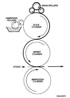
Utilizes the principle that water and grease do not mix. The image area of the palte is treated with a greasy medium. Then the plate is dampened with by rollers then inked. The ink adheres to the greasy image but not the dampened areas. The paper is moved into position over the plate and then the plate and paper are run through the press.
Lithographic has a planographic (flat). The whole surface has both ink and water with the addition of alcohol to aid dispersion.
Lithography first used smooth stone slabs to get a printing surface and this method is still used today for limited editions of fine art prints. The next development in printing came with metal plates which could be curved around metal cylinders to allow the use of rotary press. Finally the "offset" principle was developed.
Where Lithography is used, it is nearly alwayds as Offset. Meaning the inked image on the metal plate is offset (printed) onto a rubber blanket wrapped around a rotating metal cylinder. The image is then transferred from that blanket onto the paper. The reason for the rubber plate is because it is less abrasive to the plate then paper.
Advantages
-Good reproduction of detail and photographs
-Cheap printing surface
-Fast make-ready
-Rubber blanket enables the use of a wide range of papers
Disadvantages
-Colour variation due to problems with ink/water
-Dampening can cuase paper stretch or warping after binding
-Dense ink coverage difficult to achieve
-Fixed cut-off of web-offset restricts available sizes.
-Not suitable for small runs
http://draftingmanuals.tpub.com/14065/css/14065_16.htm
Page 88 The all new print production HANDBOOK - David Benn
Gravure
Gravure is a modern day version of the intaglio process. This means that the printing image is recessed (indentation) into the cylinder with tiny hollows on a copper-plated plate cylinder. The indentation vary in depth so they will leave a required amount of ink on the various parts of the printed image. The non-image area is wiped free of ink with a doctor blade. Ink is then deposited on the paper from the indentations.
The ink is very thin and being spirit based dries through evaporation in a heated tunnel immediately after being printed.
Most Gravure is done with web-feed machines. Running speeds of up to 50,000 impressions per hour. Typical jobs generally include magazines or catalogs - very large runs. Printing is from a cylinder rather then a plate which allows speed. Gravure is also used for some kinds of packaging, printing on cellophane, decorative laminates and wallpaper.

http://l-whitaker1013-dc.blogspot.co.uk/2011/10/commercial-print.html

http://www.automation.siemens.com/mcms/mc/en/mechanical-engineering/printing-machines/gravure-printing-machine/pages/gravure-printing-machine.aspx
Advantages
-Simple printing method and press machanism
-Can maintain consistent colour
-High speed
-Straightforward drying by evaporation
-Good results obtainable on cheaper paper
-No fixed cut-off (as with web-offset)
Disadvantages
-High cost of cylinders
-Viable only for long runs 150,000+
-Longer lead times than offset
-High costs of proofs, if press proofs needed
-High cost of corrections for reprints, as cylinder must be replaced
Page 100-103 The all new print production HANDBOOK - David Benn
Screen-print
A synthetic fibre which used to be silk hence the name 'silkscreen' is stretched across a wooded or metal frame.
The fibre is covered with a UV sensitive paint/ink which is left to dried in a dark room or somewhere where is out of the way of UV light. A stencil/artwork can then be placed onto the screen on top on the UV sensitive fibre. The screen along with the artwork placed in a UV light box and 'exposed' ; exposing the frame allows the UV sensitive ink to become delicate where is has been exposed to UV light. When rinsed with a hose or jet wash crumbles off the frame leaving the UV paint which was hidden by the artwork/stencil.
Ink is then placed onto the frame and pushed through the fibre onto paper using a squeegee. The paper is laid onto a flat vacuum table. The vacuum holds the paper still. The frame can be placed directly onto the paper or it can be fixed into a set position using a holding which is fitted to the 'bed' (flat vacuum table)

http://thepophop.com/events/screenprinting-introduction
Advantages
-Can print a heavy film of ink
-Economical for short runs (Even below 100 copies)
-Can print on virtually any materials
Disadvantages
-Difficult to achieve fine detail
-Very low screen halftone
-Low output qualities
-Drying requirements
Flexography
This process is a derivative of letterpress, using flexible photopolymer plates and thin, fluid inks (often now water-based rather than spirit-based) that dry by evaporation (sometimes assisted by heat) The image is raised as in the conventional form of letterpress printing.
Most flexographic printing presses are web-fed because of the nature of the products they are usually employed to print. Ink is applied to a plate by a metal roller; "anilox" roller, this roller has engraved etchings that hold the ink and transfer it onto the flexible plate for printing. Many machines are multi colour presses, for four-colour work.
Mainly used for packaging printing on cellophane, plastics and metallic foils. It is generally used to produce some of the cheaper magazines and newspapers. A good proportion of newspapers are printed using this method as the inks doesn't suffer the balance of water and ink. The ink dries instantly and doesn't come off on the hands of the newspaper reader as happens with offset printing.

http://www.qed.org/RBTL/chapters/ch9.htm
Advantages
-relatively inexpensive as the pales are cheap to make
-Make-ready times are short
-Rapid drying inks
-High speed printing
-Printed on many different materials
Disadvantages
-Difficulty in reproducing fine details
-Colour variation
Digital printing
This method of printing is ideal for short runs of prints, colour and black and white work. Unlike most other printing techniques it doesn't require film or a plate to be made which makes the start up process cheaper. Although the start up cost is cheaper the cost per print is higher then offset litho.
Digital printing uses files such as PSD, JPEG... transferring the image digitally to the printer,
This technique of printing has allowed both ultra-short run reprinting and "print on demand"- Example would be offset litho needs a minimum run of around 500 in order to be economical, with digital printing the publishers can produce order of one print which can be printed quickly.
Digital print quality is general inferior to offet-litho especially when the job has large areas of flat tints or solid colours. However this is rapidly developing as technology moves forward fast.

Advantages
-Economical for short runs (500 or less)
-Enables personalization of data
-No film or plate cost
-Shorter lead time
-Large formats possible with ink-jet printing
Disadvantages
-Quality of some digital printers is inferior to offset.
-Consumerables (toner/paper) more costly than offset
-Slower press speed
-Most presses won't print special colours
Pad-Printing
Pad printing is a printing process that can transfer a 2-D image onto a 3-D object. This is accomplished using an indirect offset (gravure) printing process that involves an image being transferred from the solid plate via a silicone pad onto a substrate (stock/material). Pad printing is used for printing on otherwise impossible products in many industries including medical, automotive, promotional, apparel, and electronic objects, as well as appliances, sports equipment and toys. It can also be used to deposit functional materials such as conductive inks, adhesives, dyes and lubricants.

http://p-adamek0912-dc.blogspot.co.uk/2010/09/pad-printing.html
Six colour
Hexachrome is an ultra-high fidelity six-color process printing system developed by Pantone, Inc. Hexachrome adds orange and green to the traditional CMYK inks for a larger and more vibrant gamut, or color range. However, such alternate color systems still rely on color separation, halftoning and lithography to produce printed images. Accurately reproducing a wide range of both vibrant and subtle colors that can be defined and displayed on computer monitors which previously could not be duplicated in print.
Foil Blocking
Also called foil stamping, hot stamping, foil imprinting and leaf imprinting - uses a heated die strike to apply a colored, clear, metallic, matte, pearlescent, holographic, or otherwise tinted foil to another surface. Foils can be opaque or semitransparent. The process can be combined with embossing for a dimensional effect; applied on top of flat printed graphics for a bit of shine or extra emphasis; or used alone to create its own effect.
The stamping process is a mechanical one- a heated die imposes the foil onto the printing surface. Registration can be a bit off from hit to hit. Type sizes should stay above 8 point and lines should be no thinner than 2 points. Foils tend to fill in in tight areas, such as tightly kerned type or lines that are closely spaced; generally a good idea to use in more open areas.
Smooth, coated stocks work best for foil stamping. Uncoated or textured surfaces present an irregular surface that may disrupt and break up the foil. Large areas of stamping can bubble on highly coated stock if the chemistry between the two layers is not carefully considered. Also foil blocking on top of coatings or inks with high wax levels will also cause the foil to adhere improperly. Aqueous and other wax-free coatings are the best for using underneath foils; ask an experienced foil stamp supplier for guidance on getting the most effective results.

Mastering Materials, Bindings, and Finishes: The Art of Creative Production By Catherine Fishel
Page 50
Embossing/De-bossing
Embossing and de-bossing takes printing into a third dimension. Paper is pressed between two molds called a die, that sculpt its fibers by as much as 1/8 of an inch. Images higher than the rest of the paper are embossed; images lower are de-bossed. Both are produced under heat to assure fine detail. Heat also makes the images smooth and shiny. Embossed impressions made without having to register over a previously printed image are said to be blind embossed. Blind impressions cost less then impressions over ink because press operators don't have to register dies precisely. Dies are made from either magnesium or brass.
You should not try to use lines that are so fine that paper doesn't press into them. Deep dies need beveled edges to avoid cutting the paper. And beveled edges optically reduce the size of the images, so prepare the original artwork slightly over sized.

Page 152
Spot/ UV Varnish
UV varnish is a clear liquid that is applied like ink and cured instantly with ultraviolet light. It can provide either a gloss or matt coating. Increasingly, UV varnish is used as a pot covering to highlight a particular image because it provides more shine than varnish.
Spot UV - The varnish is applied to highlight discrete areas of a printed design, both visually and by imparting a different texture. The effect of spot UV can be maximised when applied over Matt-lamintated printing.


Basics Design 06: Print and Finish: Print and Finish By Gavin Ambrose, Paul Harris
Page 68
Colour models
CMYK
Commercial print, be it magazine, newspaper, brochures, etc. uses a four-colour printing process called CMYK. CMYK stands for Cyan, Magenta, Yellow and Key (Black).
CMYK printing works by separating the colours, for example, from a photograph, into 4 separate coloured inks using individual printing plates. When four coloured plates are printed onto a sheet of paper, they create an optical effect that to the viewer, looks like the original image.
CMYK is for print.
RGB
RGB (red, green, and blue) refers to a system for representing the colors to be used on a computer display. Red, green, and blue can be combined in various proportions to obtain any color in the visible spectrum. Levels of R, G, and B can each range from 0 to 100 percent of full intensity.
It is important to remember RGB is for web/digital design and should be converted or thought about before designing for print.
Spot Colour
Spot colours are non-processed inks that are manufactured by companies for example PANTONE. Though printing is based on the four process colour - CMYK, it is not limited to them. It is important to understand that though combinations of CMYK inks can produce a wide variety of colours - enough to reproduce a photograph quite well, they can't produce every colour. For this reason, and others, designers often turn to spot colours.
The Design Collection Revealed: Chris Botello, Elizabeth Eisner Reding
Page 39
A Field Guide to Fabric Design: Design, Print and Sell Your Own Fabric ... By Kimberly Kight
Formats
Standard ISO paper sizes
Standard paper sizes provide a convenient and efficient means for designers, printers and others involved in printing and publishing to communicate product specifications and keep costs down.
ISO sizes are based on the metric system using the square-root-of-two ratio with format A0 having an area of one square metre. As this does not allow the page height and width to be rounded metric lengths the area of the page has been defined to have a round metric value, which sipmplifies calculations of the weight of a document (format x number of pages) as paper specified in g/m2.
The A series comprises a range of paper sizes that differs from the next size by a factor of either 2 of 1/2.
B sizes are intermediate sizes which are rarely or never used. C series sizes are for envelopes that can contain A size stationary; A C4 envelope is ideal for holding a nonfolded A4 sheet.
RA & SRA sizes
RA and SRA stock sizes are sheets of paper from which A sizes can be cut. Basically un-trimmed paper used by printers. They are slightly larger than the A series to allow for grip, trim and bleed.

The Fundamentals of Creative Design By Gavin Ambrose, Paul Harris
Page 10
Choosing and Using Paper for Great Graphic Design By Keith Stephenson, Mark Hampshire
Page 235
Imperial (North America) Versus Metric (Rest of the world)
America has retained inches for paper sizes/ Even after metrification, the printing and publishing industry still retains imperial sizes, which they have to convert to metric. Inches do not readily convert, 32 by 42 inches becomes 812.8 by 1066.6mm.
Digital Magazine Design: With Case Studies By Daniel Carpenter, Paul Honeywill
Page 28
Tabloid (compact) + Broadsheet
Newspapers are published in two main sizes: full-size Broadsheet and tabloid (compact) or half size. The tabloid size lends itself to bolder forms of layout.
Tabloid -430 mm × 280 mm
Broadsheet- 750 x 600 mm
Newspapers & Magazines By Julian Petley
Page 5
Artwork
Document set up
When designing for print you need to make sure your document is set from the start. If you don't it can cause you a lot of hassle changing the design.
ResolutionYou need to make sure your document DPI is set to 300. This is the minimum requirement for print.
Colour ModeYou need to make sure your document is set up in CMYK. IF you are using spot colours you need to make sure you have got the colour PANTONE codes on hand for the printers. You should ask if they can print these spot colours too. By adding more spot colours the final price will be higher.
File formats
You should inquire with the printers what format they require as they might not have the latest version or your version of software; compatibility issues may delay your print time. PDF is a safe option to use as generally every printer has this software.
Fonts:
You should include a folder containing all the fonts you have used especially if you have downloaded fonts which the printers probably won't have installed on their machines.
Spell-check:
Spelling mistakes can cost you a lot of money if the document needs re-printing. Make sure everything is spell checked by you and someone else who can cast their eyes over it and proof read it.
Colour specification
Printer marks
If your project uses four ink colours (this would be called 4-colour or 4-c job), you would need to include registration marks so that the pressman could exactly align the printing plates on the press. A calibration bar would be needed to measure colours exactly. The edges of the brochure and any folds would need to be indicated with crop marks.
Photoshop CS Timesaving Techniques For Dummies By Phyllis Davis
Page 102
Pre-flight check
Preflight is the process of checking a document for potential printing issues before printing. InDesign includes a preflight function. Press and printers will use a much more robust preflight system like FlightCheck, Preflight Pro, PitStop Pro etc...
By leaving your preflight entirely to your printers is a serious, potentially costly mistake. Designers should never leave press operatir to find common errors and mistakes with documents, alienating a designers best friend - his print and press providers. It will also cost more currency because printers generally charge more money to fix these common, easily preventable problems that are squarely within the designers sphere of responsibility.
Mastering InDesign CS5 for Print Design and Production By Pariah S. Burke
Page 443
Mock-ups
"Thou shall assemble a full scale mock-up of any packaging/dimensional project"
"Building a house on your computer screen is a long way from planting a shovel and moving earth. On a smaller scale, the same is true about designing anything dimensional, especially packaging. What looks like it might work structurally doesn’t bend as planned, lock together, or even stand up straight. Even after you have made adjustments and tested out the very core structure, you find the more nuanced aspect of designing in this way. How does a small piece of type read now that you know it will sit back a little on the shelf? Should the name of the product bend around to the point that you can’t see all of the letters unless standing in a specific spot? How does the design work at the folds and seams? Where does the legal copy sit?"
http://my.safaribooksonline.com/book/-/9780132907224/production-and-print/ch06lev1sec14
Proof
Printing proofs are used for checking that all text and graphics and colors come out as expected before going to press. It is a good practice to print a proof from your desktop printer and send along with your digital files to your service bureau or commercial printer. They can be black and white or in color but a good PostScript laser proof is ideal. If the file won't print properly to a desktop printer, chances are it won't come out on the printer press correctly either.
Wet Proof
A proof that is created from the actual printing plates. This is the most expensive form of proof but w hat you see is what you get; colour and paper on which your final item will be produced.
Sign-off (IMPORTANT) Make the client sign so your covered.
It is important to make the client sign off work you have both agreed is complete and that they are happy with. When printing this is extremely important as any changes the client wants to make after publishing a design is going to cost money and their may be a dispute between you and the client and you don't want to be to blame. If the client signs off the work it is then their responsibility if they want to make changes after print and you are not liable.
Stock
Weights (gsm)
Paper is mostly defined by its weight using gsm (grams per square meter) or g/m2; This is called grammage.
Photocopier papers are usually around 80 gsm; letterheads and pamphlets, around 110 gsm and posters, around 170 gsm; lightweight covers.
Finish - gloss/silk/matt, Coated or uncoated
Commercial printers commonly distinguish between coated and uncoated paper. Coated paper can be further devided into additional categories depending on the amount of coating it has: lightly coated, medium coated, highly coated or art paper. Coated paper has a smoother surface which gives it a higher printing quality. Example include brochures and high culture magazine covers. Examples of uncoated papers include stationary, photocopying and pages of paper back books. Uncoated paper is not necessarily cheaper than coated.
Matte/Silk or glossy
The surface of the paper can be calendered to obtain a higher sheen. A coated paper can be matte or glossy. Uncoated paper can be calendered. A glossy paper gives a good reproduction of image of image and colours, while text readability is poor because of distracting reflections. Matte and/or uncoated paper which is generally more suitible for readability. The texture is smooth but non-reflective, which means that the paper is treated with this coating will produce prints with a combination of high image quality and readability.
A Guide to Graphic Print Production By Kaj Johansson, Peter Lundberg, Robert Ryberg
Page 266
Laid or Wove
There are basically two types of paper - wove and laid. A wove paper is produced on a closely woven mold or screen and shows no impression from the mesh of the screen. A laid paper is produced on a coarser screen or mold supported by wires which unlike wove paper is textured.
Bookbinding & Conservation by Hand: A Working Guide By Laura S. Young
Page 30
Finishing
Binding (what type?)Any of several bonding processing using stitches, wire, glue or other media to hold together a publication's pages or sections to form a book, magazine, brochure or other format.
The most common binding methods:
Perfect
Canadian
Burst
Side stabbing
Saddle Stitch
Z bind

The Visual Dictionary of Graphic Design By Gavin Ambrose, Paul Harris
Page 38
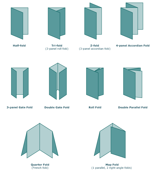
Folding and creasing
Folding encompasses a range of different methods for turning a printed sheet into a more compact form or signature.
The majority of folding techniques make use of the basic valley and mountain folds to create a series of peaks and troughs.
Types of folds:Valley fold
Mountain fold
The Production Manual: A Graphic Design Handbook By Gavin Ambrose, Paul Harris
Die stamping/ drilling
The process includes making cuts in a printed sheet in a configuration that will allow it to be assembled into a functional piece, such as a door hanger, pocket folder, or carton. Die-cutting also includes cuts that enhance a piece's design appeal, such as die-cutting a holiday greeting card in the shape of a Christmas tree. Dies are typically made from bending metal strips with a sharpened edge into the desired shape and mounting them onto a wooden block. The metal sharpened edge is higher then the wood like a biscuit cutter for example. Printers often keep common shapes such as pocket folders or table tents.
Cutting labels and decals from printed paper, but not its backing is called kiss die cutting. Sheets printed this way allow the label or decal to be peeled away from the backing.


Drilling/punching: Pieces that are ring or post bound require holes ranging between 1/8" and 1/4". Commercial printers and binderies use a drill to make these holes according to size and placement specifications. Spiral and plastic comb binding require punching holes, a process that costs a bit more than drilling.
Forms, Folds and Sizes, Second Edition: All the Details Graphic Designers ... By Aaris Sherin
Page 153
Costing
Get a quote very early on, before you start the job in the earnest if possible
The only way you will know you are getting the best price is if you get quotations from all of your printers you could potentially use. Spread them out for comparison and interpretation. Examine any items that you did not request, and add up all the miscellaneous prices. You might find printers that are not local are cheaper even with delivery costs.
"Don't be concerned with about hurting the feelings of your local printers. If there bids are not the lowest, show them the other bids. This is your excuse for not giving them the work. They will be interested in what competition is quoting and will appreciate your openness "
The Self-Publishing Manual By Dan Poynter
Page 109
Learn roughly what things cost (unit cost)
If you know roughly what things cost your going to have an advantage over someone who doesn't. You don't want to be paying more then you should for printing as it can be very expensive. If you are working with a client you want to get them a reasonably priced printers as they are more likely to work with you again.
Understand viable minimum quantities
It would be noncommercial to use a large book press for for a short run of headed notepaper, and equally noncommercial to use a small offset press for 100,000 copies of a magazine.
Delivery?
Mensioned delivery briefly. If you re printing you need to make sure you have a means to get the prints from A to B without damaging the prints. Think about transport and if you are not able to transport the published work how are you going to get the work delivered? Find out what the printers charge.
Glossary
Sheet-fed - for sheet-fed printing paper must be first cut into sheets of a sustainable size.
Web-fed - (also known as roll-fed) printing, the paper is supplied to the machine in the form of rolls (reels).
Make-ready - An operation that applies to all printing processes is "make-ready" - all the operations that take place on a press prior to the first print. Setting up.


