Friday, 24 February 2012

Final Poster - Rain Brief

Final poster which after David suggested moving the full stop and making it look like the mouth of the figure. When I was trying out this idea I realised it looked better as a little mustache! I think their is still room for improvement but I am happy to send this to the crit.

Again it is similar to the other posters because of the text. I drew the man with the intentions of possibly screen printing the illustration. I

Wednesday, 22 February 2012

Rain // Erek Kessel Live Brief

Just realised I've spelt Britain wrong here.

my idea for this is the rain in the UK influences fashion. The UK plays a big part in global fashion trends so I thought I would link the two together. I hand stitched the rain in on the above poster. 

The sowing needle image was sourced from http://www.ksl.com/?nid=148&sid=13921690
The rain poncho was sourced from http://www.wingateproducts.com/content/stormtech-packable-rain-poncho-unisex
The knitted poncho was sourced from http://www.fashionunion.com/jumpers+cardigans/navy-button-through-fairisle-poncho/invt/lknc2166nay/

Design Process 
 
I hand stitched the rain. My idea was that relating rain to fashion and the influence that rain had on British fashion that it would make sense to stitch in the rain. Once I stitched in the rain I live traced it because I found it difficult to render the white from the stitch and place it on the poster.
  
Here you can see it on the poster after it has been live traced.


 Design Sheets


F*** Moonpig. // Valentines Day Card


For Ruby. x

Tuesday, 21 February 2012

Amber - Lines / Likes / Logic (What is a line?)

LINES
  1. Lines of people
  2. Lines of type
  3. Lines if fences
  4. Stairs
  5. Razor blades
  6. Spaghetti
  7. Photo frames
  8. Cane rows
  9. Hair
  10. Bricks
  11. Stitching
  12. Blinds
  13. Road markings
  14. Maps
  15. Scaffolding
  16. Ties
  17. Combs
  18. Football netting
  19. Hedge rows
  20. Lines of trees
  21. Pencil tins
  22. Blue prints
  23. Graph paper

LIKES
  1. Trainers
  2. Curry
  3. Fifa 12
  4. Football
  5. Dogs
  6. Clothes
  7. Fishing
  8. Sea food
  9. Dim sum
  10. Ruby
  11. Sun
  12. Film
  13. Print
  14. Royal park
  15. Ale
  16. Double cheeseburgers
  17. Comfy boxer shorts
  18. Fishing
  19. Fine liners
  20. Holidays/ traveling
  21. Going out

LINE/ LIKE/ LOGIC
Hair/ Film/ Photography
Blinds/ Ale/ Type
Maps/ Print/ Publication
Stitching/ Fine liners/ Colour
Graph paper/ Dim sum/ Type

1. I am going to create different hair styles using shots from films.
2. I am going to create patterns using the shapes of fine liner pens which are laid out in stitching styles.

Monday, 20 February 2012

RAIN // Precipitation - Research

Facts
- The met office says it rains the most in the lake district.
- Manchester is the second most rainy place in the UK
- The umbrella was originally invented to protect people from the hot sun.
- Rain drops can fall at speeds of about 22 miles an hour.
- Rain starts off as ice or snow crystals at cloud level.
- Light rain is classified as being no more then 0.10 inches of rain an hour.
- Heavy rain is classified as being more then 0.30 inches of rain an hour.
- Rain drops range in size from 0.02 inches to about .031 inches.
- Rain drops do not fall in a tear drop shape, they originally fall in the shave of a flat oval.
- Rain that freezes before it hits the ground is known as frozen rain.
- Rain is recycled water that evaporated from our worlds lakes, rivers, oceans, seas etc.
-
The most rain ever recorded in one day in the UK was 279.4 millimeters in Martinstown Dorset 18th July 1955
- One inch of rain falling over an area of one acre has a weight of about one ton
- The roof of a typical family home captures over 100,000 litres of rainwater a year
- There are about 1 billion tons of rainfalls drop on Earth in a minute
- The average speed of rain water fall is just 8-10 km / hour.

Why is rain so good?!
- When you cry in the rain people cant tell
- It smells nice when it rains
- When its raining and you manage to find shelter you have a massive appreciation because you are no longer getting wet.
- The sound of rain on your window has been described as enchanting
- Appreciation that rain is a natural occurrence
- Rain gives you an excuse to just take a short break
- It cleans the streets
- Its relaxing when your inside
- When you get caught in the rain and get wet its quite a liberating feeling
- When it rains it makes it cosy inside.
- Waters your plants for free
- It feels nice on your skin
- Football in the rain is fun
- Rain is uncontrollable
- Less chance of getting skin cancer
- No such thing as droughts
- It makes you appreciate the sunny days more making them more enjoyable
- People make good songs about rain
- No hose pipe bans

Research, Inspiration.

 African elephant portrait
White Rhinoceros Portrait
'Lumadessa is a little art and design label by Josh Brill. Focusing on limited edition art prints and design products, that implement premium materials and production methods. Resulting in timeless works with longer display lives.'

Cool colour palette. 


Mcbess, Matthieu Bessudo. What an absolute beast... I wish I could illustrate like this dude. Simply unreal.
Might have to buy a print even though a skint student.
Check him out!

Wednesday, 8 February 2012

Self Evaluation

What skills have you developed through this module and how effectively do you think you have applied them?

I think what I have developed with throughout the 100 Things project is decision making. The appropriateness of the content of research. I have been collecting for medical cannabis and cannabis in general quite a controversial as a subject I felt. With the How To project we also came to a point where we had to change our initial idea from chess to skateboarding and we all agreed as a group this was a good idea.

With the 100 Things project I had to stand back from the decisions and try to look at the decision to go with medical cannabis from a neutral viewpoint. It might sound like a fairly simple decision but with the stigma that some people have with cannabis and medical cannabis it was definitely a decision to consider. I had to start doing research before I could make a decisions; the more research I did the more confident I felt about the subject.

Also collecting information and decided whether the information and data is reliable and relevant. Seeing as the final products are the end result of the statistics and facts we found presenting them graphically it is important my information is accurate.  Especially as I was effectively promoting legalisation of medical cannabis for people with diagnosed illnesses. This is a serious subject which meant I had to be careful what message my end products connotes.

I have definitely improved my understanding of presenting figures in the forms of info graphics. When we started the module I had no idea where to start in sorting statistics and facts for graphics. Categorising and finding information which works with the info graphic style. I think my info-graphic style has improved generally from simply looking at other designers work. I have found some good resources which I have shared on my blog.

I have tried to push my experiment with different medias and have created a wide range of products for 100 Things, some of which I havnt tried before; one example are the vinyl stickers and the giant rolling paper net.

When we printed off our group poster if was a really big print. As the height was so huge in resulting in working in a different way. We had to consider how to physically create the graphics on illustrator because the canvas was so big and usual to anything I have worked with before. As a group we also had to fuse our work together which meant accommodating other members of the group work on one canvas. Practicalities, individual style, working practices and physically transferring work had to be considered.

What approaches to/methods of design production have you developed and how have they informed your design development process?

One big consideration that I am becoming more aware of is printing. When printing in college it is a good idea to book in advance which I did  for this module. Considering possibility and situations that might occur. For example James being ill. Luckily this didn't effect me massively but it still impacted my work slightly. In the future I will make sure that I am prepared for anything and that I have sufficient time in the printing rooms.

Its not just getting into the print rooms or getting a slot its how the printing is going to turn out. If something miss prints when printing on your own stock you need to make sure you have spare stock  available. Just little things in preparation make the whole experience run smoothly.

I am more aware then ever about stocks and the influence they have on a final product. I found the water colour paper looked excellent for my posters but not so good for my rolling paper packet. So more experiment in the future with stocks; maybe I will order some experimental stocks for the future.

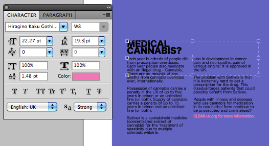
The media and context was more consider for this module and for the How To and 100 Things I think we had a good attempt. I think I could refine the purpose and context of a couple my products for example the smoking tips and the informational poster. I went with the conclusion and notion that the informational flyer would be left somewhere in a guerrilla fashion for people to pick up. This was just idea but it ended up happening even though I am not 100% sure about it.

I felt that the smoking tips is borderline great/ terrible idea. Promoting smoking combusted plant matter through a paper filter feels wrong even though I feel I have done it for the right intentions. I found their simply wasn't enough evidence for me to make a fully informed decision. I made the decision based on the current trend of people predominantly smoking cannabis with paper filters already and trying to infiltrate this trend with the end results being that the user would be more informed to alternatives and the safest way to smoke if they were going to anyway. Almost like a cigarette shock message but toned down.


The experimentation with different media was good and I enjoyed making the rolling papers. People seemed impressed with the final designs. I think I made a good choice here in experimenting and testing possibilities. Double sided prints! I didn't enjoy working out the how print double sided prints. I have made so many mistakes with the layouts and printing. Also I didn't realise the method of doing double sided upstairs with the mac studio printers if different to the digital suit method. This links again to preparation when printing and something I had to change on the spot which I found difficult and confusing. Luckily James knows his print and was able to tell me what needed to be done.
What strengths can you identify in your work and how have/will you capitalise on these?
I personally found my 100 Thing subject interesting and relevant in the current times. Maybe its only interesting to me but I tried to show why I was so intrigued by the topic and communicate this to others. Hope fully I did this. I think finding something that you can find interesting and can remain focused on developing for a long brief is a skill. I also tried to make things I didn't find that interesting, interesting. I think I did this well with the skateboard brief.
Again I am going to try and keep experimenting with media and continue to try different final products. I will continue to test ideas and keep an open mind to what and where my project might end up.

I think the finish of my work is of a high standard. My work practices when it comes to using a scalpel, storing work, print and construction is good. Even when sometimes it might feel as if it doesn't matter such as concepts I still try and make sure the finish is to the best of my ability. I try to take care where I can and I will continue to do this as it is a good habit and looks professional.

What weaknesses can you identify in your work and how will you address these in the future?


I still find the presentation of my work in final crits can be improved. I usually focus all of my attention making sure the products can be the best I can get them and then realise the way I have left something on a table isn't complimenting my work as well as it could lets it down. I need to do some research on presentation. I will focus on presentation in the future and will document different interesting techniques which work subtly.


I need to plan my days more efficiently. I tried to make more lists of tasks to do for this module but I found myself loosing track of tasks that needed to be done which has definitely negatively effected the module. Stupid things such as forgetting about a part of a task of documenting design sheets. I am pretty annoyed with myself about this and will address it by working out some kind of fool proof system.

Identify five things that you will do differently next time and what do you expect to gain from doing these?

I will book more print slots with an informed idea and plan of action. This will mean no rushing around and worrying about deadlines. Trying to predict print results and making sure I am covered for anything that might occur.


Using my planner instead of using odd bits of paper. I need an official system of documenting tasks. I use my planner but I don't like the layout and feel as if I cant write everything that needs to be done. I think this will improved my efficiency meaning I will have a larger contents at the end of a module.

More design sheets. I have not got enough design sheets and I think its because I have gone off drawing. I need to practice my drawing and involve it in my design more. I do a lot of digital illustrations now but I need to happen on paper too. I get frustrated when I draw something by hand and it doesn't work well.

More research. Especially primary research and less dependence on the internet for all of my research. I had a few days in Liverpool walking around the city and I found it good for my design as I was constantly picking print up and seeing design in a different context from the web. This will inform my design in the future and it give me a broader range of ideas and possibility's.


Presentation skills as I have mentioned. I will make the presentation of my work just as important as the finish and design. I did a lot of presentation skills on my foundation but focusing on new things here has made me push presentation to one side. Back to basics I think.


Poster Finals // 100 Things


Tuesday, 7 February 2012

Rolling Paper Packet + Tips


Giant Rolling Paper + Stickers, Finals // 100 Things

Im really pleased with the finish and result of this giant rolling paper packet. I think its successful in promoting the concept brand.


Stickers finished and printed:


Stickers 2 // 100 Things

I used the same design as the giant rolling paper pack. I think the design will work for stickers also. The purpose of the stickers is to promote the brand of rolling paper. So by using the same advertisement this reinforces the brand.
  
I had to export the image from Photoshop to illustrator so that I could use the vinyl cutter. I had to draw a path around each sticker which allows the vinyl cutter to cut along that path.

Monday, 6 February 2012

Feedback // 100 Things

Really quite happy with the feedback I got. I agree with the weaknesses and I am going to try and re print the medical cannabis in the house of commons posters. I will use a bit more colour like suggested and also correct the spelling mistake I found earlier.

I'm glad I did a variety of products in different medias. I think the giant rolling paper packet worked well and the intention of grabbing the audiences attention worked well. I think the fact that I made a concept rolling paper packet was something different which was positive.

I need to print my remaining products off. I should of at least made a mock up of the last two products but I didn't think it would have been worth it. It definitely was. In the future I am going to invest more time in the presentation of the final outcome. I think I could of presented the big rolling paper packet better as well.  When people are looking around you need to grab their attention and even with some great products that are perfect, if the way you present them is poor it diminishes the experience. I know how to show my work off I just need a bit more effort and consideration when doing this.

Hopefully I can continue to get this kind of feedback!

Rolling Tips // 100 Things

 I know this design is quite samey but for the purpose of branding U think it has to be similar to the other products I have done in order to create an concept brand identity.

If you look at Coca Cola probably one of if not the most successful brand identity you can see the consistency in designs.
When I print the tip ends I need to make sure I consider the binding. If I only print the tip face and back page I will miss the spine of the tip cover which I am going to stick on an existing product I bought.

Rolling Paper // 100 Things

This is the promotional rolling paper poster. I wanted to screen print this onto paper that mimics rolling papers but not having my screen print induction means it isn't possible. I will be using fire paper which James suggested (Print technician). The design is really simple but the media works well I think. Hopefully the attention to detail with the giant rolling paper packet and the promotional inside paper will be look impressive.

Giant 3D Rolling Paper Advertisement // 100 Things

Got the same net as I used for the small rolling packet  and started of with a pretty similar design. Which made sense as the advertisement is to promote the concept of new rolling papers.
Started making the front to the rolling paper packet.
Truth = Pacifo
Premium = Ostrich Sans
Telegrafico = Rolling Papers
Cubano = NEW
I originally took pictures of a printed of rolling packet, rendered it and stuck it in place of the current illustration. It looked awful. So I had to trace the photo of the packet.

Here is the original photo of the rolling paper packet I constructed.
 

Tracing process:
Free transform to get the perspective and angle right.

Here is the final packet. The middle truth logo has to be upside down so that when the packet is put together it flips and works.

Flyer // Infographics 100 Things

Flyer. I started off using the pink trying to carry on using a consistent colour scheme. 
  E778AF - Pink
6361c8 - Blue/ Violet
  
That list of countries are the places where medical cannabis is legal and controlled. 

I changed the leading to compact 'medical cannabis' I had to use Photoshop but I would of liked to do this flyer in InDesign but that would of meant I could only work on it at college as I don't have the software on my laptop.