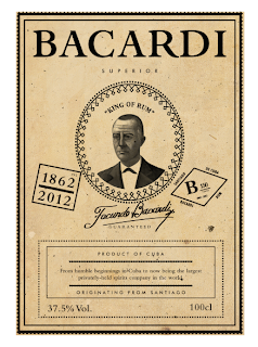
I Have started creating the mock ups for the Bacardi brief. I basically started doing digital mock ups to see how the products look before I print them and commit to a certain design.
I have finally settles on the following products:
- Hip flask
- Cardboard container
- Mug
- Bacardi bottle
Initial Designs
I made my decision by thinking how the product would appear on shelve and also production costs not just for Bacardi but for me also. I measured the labels by physically measurement my bottles with a tape measure. This is more reliable and I can see how the label will fit around the bottles circumference etc.
The bottles label which will cover the bottles cork/lid. The label also acts as a sealant so that the customer can see if the bottle has been tampered with and opened which is important.
I started designing with the idea of using a map theme. I experimented with the map theme but decided it didn't look how I wanted it too.
Initial Mock ups
Here is the mug I bought online. I photoshopped this design onto the mug. I have come to the conclusion that buying vinyl stickers is not possible because of the cost which is high dew to the small quantities I will need (1-3) It was something like £30 for a sheet of 40 which I cant afford.
Although I would of like to physically mocked up the design it doesn't matter because you cant tell from the pictures I will take that I have photoshopped them. It also illustrates the idea and in real life the clear vinyl's would be achievable
The hip flask which I also mocked up for the same reasons as the mug. I like the idea of a hip flask and I think it would appeal to the target market. I know I think hip flasks are desirable and I am in the target market.
The hip flask would be given away as part of a special addition or free give away.
The two images below are the same mock ups as the two previous images but I added a texture which makes the mock ups looks more realistic. This is something to consider when I take my final images.
This is the box which I actually received a takeaway in before christmas. I think its perfect for this brief and I can see it housing my products. The box can be recycled and also when transported is good because of the dimensions it stacks well saving space which in turn reduces its eco footprint.
It has a convenient handle which makes it easy to carry too. This is only a mock up but I am going to create the same box but which fits 1 bottle of Bacardi and fits into the supermarket shelves. The current box is quite large and wouldn't exactly fit my Bacardi bottle inside it snuggly. This mock up works to give me a feel of what it will look like and also to identify if it works visually.
This takes me to shooting the range. I have booked the photography studio in college and a friend from the photography course is going to show me around and help me out.
I started looking at layouts that will flatter my range and best show what I have produced off.
The main product that I really want to photograph well is the Bacardi bottle its self. I am going to physically mock two bottles up and see which one looks best before I decide on which one I want as a final.
This bottle is a good shape. It is different from Bacardi's 8 bottle and superior bottle. I have a couple more bottle I am going to test under the photography studio lights. We will see which ones are photogenic and which ones are not!
Label Designs
I have that feeling that I have been looking at the label design for too long! I have lots of different concept which I cant decide are good or bad. I am in the process of elimination.
I am going to use an antique white stock to make the bottles look old. Here you can see different textures and stock tests. The variations are only sight but make a difference.


No comments:
Post a Comment