Front cover
I started by designing the front cover to my COP2 practical response, but ended up leaving it to finish until the end basically because I thought it was more important to get the main body of content finished before perfecting the aesthetics of the front cover. I already had some designs in mind from design sheets I did so I was confient it could wait.
Design sheets
Digital Designs
Front cover - My idea is that the collection of little rectangles represents all the small houses which when layered under the vellum sleeve will fit into the big rectangle representing the big house. I'm trying to show the that the collection of people could all live off the amount of resources that one big house consumes.
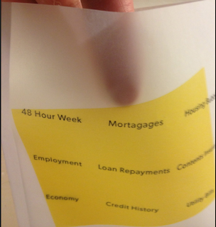
Vellum sleeve - This is the big rectangle (house) that will appear on the sleeve of the publication over the front cover. I like the idea of physical action of pulling the publication from out of the sleeve.
I started to develop the front cover image.
Here I made a mock up. It was quite hard to line up the filled orange rectangle with the smaller rectangles. It was also difficult trying to glue the vellum together as prit stick wasn't doing the job.
Contents + Spreads
I began by annotating the 'We the Tiny House People', I added my own commentary and also recorded interviews with the featured homeowners that I found insightful and interesting. This is how I started to build my content and also begin to build a narrative and some kind of structure.
Once I knew the structure of the publication I began designing a layout for it. I mocked up a quick paper book and began writing the headings of where roughly I wanted the content to go by chapter. After I did this I made another mock up with some more detailed editorial design. You have to make paper mock ups or I just find myself staring at the screen for hours doing nothing.
Here you can see my digital mock ups. I printed around 8 copies of my book mainly to figure out what print settings I needed! but also I was experimenting with new layouts and interactive parts of the booklet.
Below you can see where the spread doesn't match up properly.
Eventually I decided on a pearly grey stock as it made my images pop and also it complemented the orange I used throughout.
Construction of sleeve
I the reason I used vellum was for the layering effect it allows. I also thought that is signifies kind of a high class wealthy look within print. The idea being that you take the publication from out of that context.
Had to set the printer to fast print so that it didn't bleed ink as the vellum was quite coated.
Here is the template for the vellum sleeve. I had to increase the width from the original because it kept opening the seem when it was flush.
Binding
I went for a saddle stitch seem as I thought it made more sense and had more correspondance with the context. Having a home made feel, little materials and DIY.


No comments:
Post a Comment