I started off by creating a master layout which only consisted on side heading. I tried to insert page numbers but I havnt been able to yet.
I am keeping my layout simple as the purpose of the print booklets is to inform my audience. The information needs to be presented clearly. Although my layout is simple I have experimented with it. I am trying to present the information but also presents my current contemporary design.
This is the master page.
Lithography page
My layout varies for every page. This is quite consuming but I am actually enjoying it. I used to pretty much hate editorial design and layout but from this I am getting into it. Which is honestly surprising.
Gravure page
Screen print page
Flexography page
Digital print page
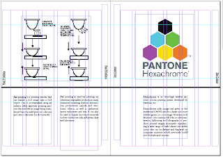
Pad printing and Hexachrome
Foil Blocking
Embossing/ Debossing and Spot UV varnish
Weight and finish
I keep changing from my initial plan of the pages I have laid out. I'm finding some content is limited which I purposely choose to be refined, this is effecting the number of pages I have and also the way I am ordering Print processes and stock.


No comments:
Post a Comment