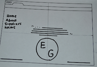
I sketched out some web browser frames so that I am not wasting time by drawing out each frame every time I want to make a website scamp. I wanted to find a layout I thought would be appropriate to my theme but also had a contemporary feel.
I like this idea of a homepage full of images. Instantly the user will see some hard hitting but true scenes.
This would require some java script.
Vertical navigation, basically a fancy blogger layout.
Here I was jotting ideas down about why my website would use certain colour and fonts, for example I thought the grey background and red went well as a theme of blood gold and sand. I made the buttons a gold tone to represent gold bars.


No comments:
Post a Comment