I did the wire frame in Illustrator after getting the hang of using a grid.
Here is the final thing. some of the measurements will need adjustments which I will make on screen. I am not sure how it will actually look in Dreamweaver so it's best I leave some room for changes. This website is going to be minimal but aesthetically pleasing still.
I may also centre my buttons as I am not sure they look right at the side towards the lower of the page.
I applied the current colour swatch I am using and started arranging the page and I also created the buttons. The buttons are meant to represent gold bars. I think I am going to make them look more like gold bars, they look like bricks at the moment.
I added an introduction to the page. From there I think the user will get the idea.
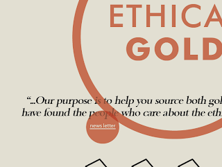
The new addition is a news letter circle which hovers freely over the website, the user can move it and when they click on the underlined text it will take them to a news letter sign up page.
I love how the transparency makes it a new colour when the two objects overlay.
It will literally be free to rome!


No comments:
Post a Comment