Thursday 28 February 2013

Responsive - kamchatka heliski (t-shirt design)

I received some feedback from the client on design crowd. The client wanted the images placed on the front of the t-shirt with each images placed on a separate board. 

I made the amendments and uploaded the images. Below you can see the message from the client and then the new boards.


Amended design boards


Design sheets


Grids & Devine Proportions - Phil

Construction

Before you can apply a grid you need to understand the requirement of the grid. Gives you an idea what to work from. Typeface, text & illustrations, print method and paper quality must be confirmed beforehand.

Always start with small sketches...

Thumbnail sketches will make your job of final layouts easier and productive.

Before drawing your sketches, consider the number of columns needed.

Disadvantages of six column systems are that lines of text will be narraw. Small typeface will have to be used. But this solely rests on the function that is to be performed!


The width of a column dictates the size of typeface used.
The rule:
The narrower a column is the smaller the typeface.

8 Filed Grid
A4+  Formst
8&20 grid fields

8 grid fields are used frequently for advertising.


Wednesday 27 February 2013

What is good? - Amended Brief

From the audience research I did I have now specified my audience. I feel a lot more informed about my subject from the research which is good as now I feel I can be confident when explaining my audience as I have the information on hand to prove my reasoning.

Although I now have identified the audience, it doesn't mean I have to solely accommodate to their needs. For example if I included brail or audio commentary for people who are blind, it would not deter the audience who have vision. Another example is the fact that more women in general visit the V&A doesn't mean the exhibition is going to pink or more accommodating to women, why should it?

An example where it might take effect is the age people visiting the gallery. Children under ten are scarce to find from the research conducted, so there is no relevance designing or curating with them in mind because it would exclude the main audience.

you can view the amended research below.


Amended Brief 


What is good? - Audience Research


Audience Research

From the feedback I received about further researching my audience this is my response.

I found three different surveys done by three different bodies online. The most relevant to my audience is the research done by the V&A 2011

The Victoria and Albert Museum (often abbreviated as the V&A), is the world's largest museum of decorative arts and design, housing a permanent collection of over 4.5 million objects.

I am going to base my audience from the audience of the V&A as it the gallery that has the most similarities with the style of exhibitions to mine. The audience will be generally if not the same as mine.


Condensed summary of the demographic - V&A

The audiences of the V&A are generally:

  • Employed with non manual jobs
  • Majority have completed full time education and achieved a Degree or higher.
  • Less then half of the people that visit galleries and museums are in the creative industry.
  • Predominately white - Irrelevant to my audience
  • Majority are English speaking
  • Individual adults visit galleries the most followed by groups and friends.
  • Majority of people are able bodies, which is interesting for me as the human senses may play a part in my exhibition. 
  • Larger amount of women visitors
  • Predominant visitor groups were people aged 25-34


All of the Secondary research 


National Museums

http://www.nationalmuseums.org.uk/resources/press_releases/record-visitor-numbers-uk-national-museums/

Record visitor numbers to UK national museums

Press Release
Date of release: 30 September 2010

This summer saw a record number of visitors to the UK’s national museums.

Over 5.7 million people visited UK national museums in August 2010. This represents an increase of 11% from August 2009.

Highlights include:
A total of 809,443 people visited the four branches of Tate in August, a 15% increase on last year.
The Victoria & Albert Museum and the Wallace Collection both saw a 24% increase in visitors compared to August 2009.
The Natural History Museum had 592,534 visitors, a 17% increase on August 2009, and the National Gallery had 568,375 visitors, an 18% increase.

In total the UK’s national museums welcomed over 42 million visitors in 2009/10.

The latest Taking Part National Survey of Participation in Culture and Sport results also show an increase in museum visits. The survey showed that in 2009-10:
46.7% of adults visited a museum, gallery or archive – an increase of 11% since the Taking Partsurvey began in 2005-06.
68.8% of children aged 5-15 visited a museum, gallery or archive.

DCMS-funded national museums have seen a 41% rise in visitor numbers since the introduction of free admission in 2001, from 28.5 million visitors in 2000-01 to over 41 million in 2009-10.

Highlights include:
National Maritime Museum – 197% increase in visitors since 2001.
National Museums Liverpool – 178% increase.
Natural History Museum – 159% increase.
Victoria & Albert Museum – 105% increase.


The Taking Part 

Survey has run since 2005 and is the key evidence source for DCMS. It is a continuous face to face household survey of adults aged 16 and over in England and chidren aged 5-15 years old. This latest releases presents rolling estimates incorporating data from the first quarter of year seven of the survey.


http://www.culture.gov.uk/publications/9547.aspx


V&A

Report on British Galleries- follow up demographics 
survey to compare with baseline survey and Creative 
Research survey of May 2011

http://eprints.bournemouth.ac.uk/15142/1/British_Galleries_Report_2011.pdf

4.2.2: Occupation and job related data Q4-Q11. 

The majority of visitors to the British Galleries are from Occupation Group B at 53%. 31% are from 
C1, 11% are from A, 3% are from C2 and 1% are from D. 

77% of all the noted occupations are full time, with 5% working part time. Less than 1 % are 
housewives. 13% are students 3% are retired on a state and personal pension, less than 1% are 
on state pension only and 1% are unemployed. 82% are employees, 18% are self-employed. 
12% have manual jobs and 88% have non-manual jobs. 66% have responsibility for staff and 33% 
have no responsibility for staff. 

Approximately 3 percent of the total National population are Group A, which mirrors the results of 
those surveyed in the British Galleries. These are professional people, very senior managers in 
business or commerce or top-level civil servants. It also includes retired people previously grade A 
and their widows. 

Group B is only 14 percent of the total National population they are middle management 
executives in large organisations, with appropriate qualifications. Also included are principal 
officers in local government and civil service, top management or owners of small business 
concerns, educational and service establishments and retired people who were previously grade 
B, and their widows. The large majority (53%), of visitors to the British Galleries are this group. 
The reason this group is so much higher than the National average may be due to the fact they 
have a greater disposition to visit heritage sites than some of the remaining occupational groups. 

C1 nationally represents 26 per sent of the population. This group is made up of junior 
management, owners of small establishments, and all others in non-manual positions. Jobs in this 
group have varied responsibilities and educational requirements. It also contains retired people 
who were previously grade C1, and their widows. 

C2 nationally is 25 per cent of the population. This group comprises of all skilled manual workers, 
and those manual workers with responsibility for other people. It also contains retired people 
previously grade C2 with pensions from their job and their widows. 

Group D is approximately 19 per cent of the population and is all semi-skilled and unskilled manual 
workers, apprentices and trainees to skilled workers. It also contains widows of partners 
previously grade D who receive a pension from their late husband’s job. 

4.2.3: Completion of full time education (Q12) 
As can be seen from table 4.2.3 the percentage of those visitors who have completed full time 
education varies little to visitors surveyed in the British Galleries last May. 74% of visitors to the 
British Galleries have completed full-time education. 


4.2.4: Highest Level of Qualifications (Q13) 
Table 4.2.4 shows that at least 69% of visitors to the galleries have achieved a Degree or higher. 
This shows little change to previous studies.


4.2.5: Involvement with the creative industries (Q14) 
Table 4.2.5 shows the percentage of visitors to the British Galleries who are involved in 
professions within the creative industries. 34% in total are involved in creative industry as opposed 
to only 23% last time. Figures were not available at the time to compare with the original baseline 
study in 1997 of Creative Professionals. 

4.2.6: Ethnicity (Q15) 
88% of all visitors to the British Galleries are of white. This is slightly lower than in previous 
studies were 93% of visitors, were of white. 

4.2.7: First and Second Language (Q16) 
77% of visitors have English as their first language, which is similar to previous research. 32% of 
visitors have English as their second language (higher than previous data). 26% of visitors had 
French as a second language. Only 10% of visitors had no second language. This low percentage 
would be due to the high number of overseas visitors to the V&A over the Christmas period. 

4.2.8: Capacity in which visiting (Q17) 
The most popular type of group is family & friends at 19%.

Individual adults at 59% are the 
largest audience type. 

4.2.15: Illness and ability to enjoy visit (Q24&Q25) 
Very few people have a long-term illness only 4%. Of these visitors half did admit to having their 
visit affected by the limitations of their illness or old age but this was only 6 people. These results 
are very similar to results in the previous survey.

4.2.16: Gender (Q26) 
The majority of respondents were women (64%), however, even when all people in the group are 
accounted for 62% of all visitors to the galleries are women. This differs to previous results. There 
is no obvious explanation for this result.

4.2.17: Age of respondent and of those in their visiting party (Q27) 
It can be seen if all children’s’ age 
groups are combined, there are 10% of children under the age 17 visiting the galleries with their 
families or with a secondary school party. There were no primary school parties visiting during this 
survey period. That amounts to 24% of visitors under the age of 24. 
The predominant age group visiting the galleries is the 25-34 year olds, which is consistent with 
both the baseline and Creative Research data. 
It should be noted however that the baseline age groups differ slightly as mature age groups were 
55-64 and 65+.

4.3. Some extra comments from visitors to the British Galleries 
There is a general agreement that the majority of labelling and text size on labels is fine for 
most. However, there are difficulties with the lighting. Some times reflections make it difficult 
to view instructions, labels and text. Perhaps more can be done to alter the reflections of the 
lighting so labels do not glare. 

There are very few noticeable differences between recent results from the demographics 
questions asked and those asked in the May 2002 survey, apart from the presence of more 
children in the galleries. 

There are children visiting the British Galleries. When all age groups under the age of 24 years 
are combined the baseline equates to 21% and MRG surveyed 24%. Even though there were 
children in the galleries it may be necessary to promote the galleries to families and schools 
more as the children who were there were freely using all the interactive materials and enjoying 
themselves. 

There was a sizeable amount of positive feedback volunteered from many of those who were 
interviewed. The general perceptions were that the V&A had excelled itself with the new British 
Galleries and the percentage of people who had visited on more than 4 occasions in one year 
is a testament to that.


What is good? - Concept Pitch Feedback

I was in the 11 o'clock group which gave me time to print my design boards off again. Lucky as I didnt have any print credit when it came to printing. I was first to present my work. I am happy with how I presented the concept as I feel I came across confident and translated what I was thinking to the rest of the group.

My design boards didn't get any criticism which is always good!

I didnt really recieve any feedback on my concept apart from that I should review my audience on the brief I wrote last night, as a few words I have used to describe the audience could be considered vague. For example the describing word enthusiast. I meant museum/gallery enthusiasts but this needs specifying further. The last bit of advice was that I should research my topic further which I am doing anyway. I have a lot of content but I couldn't put it all on my boards or there would be too much information.

Next time I will write a script again because it really helped today. It helped by making me sound coherent and efficient when communicating the information. I should of defined perception in more detail because if you are not aware what perception is to begin with a brief explanation may not be enough to understand, but with three minutes to present it is hard to be extremely thorough.


To do

I will re-write my brief once I have researched who my target audience is. There is no point re-writing the brief if I still dont know who the audience is. To further research my audience I am going to do some  primary research by going to the Royal Armouries in leeds. This gallery is free and I heard on recommendation that is has some interesting stuff in there. I am also going to go the Leeds City Museum.

I am also going to do some web research to see if I can find any old studies on the audiences of art galleries, museums and science centers. I really need to nail my audience before I can continue with general research.

Tuesday 26 February 2013

What is good? - Ammended Design Boards + Re-written Brief

Here is the brief I have re-written up in response to the workshop we had today for tomorrow. although we had feedback on our idea and boards today we are going to repeat the process in different groups tomorrow with a fresh start and stronger concept.

Brief


Amended boards

I got around to making the changes to the design boards. I didn't have to make massive changes so it didn't take too long to do them again. I changed pretty much everything that got brought up within the crit.


What is good? - Designboard Feedback + Workshop

Today we brought our boards in and in groups of six we passed the boards to the left so that every board got feedback from every individual on the table. We wrote comments on the board and if people agreed with the feedback once it was their turn to crit the board they added a mark to state this.

The purpose of this workshop was to help us understand what makes good design boards with the purpose of the design boards being to communicate our concept to the audience which today was my peers.

Its not about trying to make the design boards looks super jazzy or contemporary to my personal taste. Although I added my personal touches I tried to make the sole purpose communication.


Below you can see the my original boards as a PDF and I have copied the feedback from the printed design boards.

Design boards PDF:


Feedback on boards:

The titles on my first boards need positioning to the left because when they are positioned to the right people read the second column of text first, from right to left. This is not how I want the paragraphs to be read.

Maybe condense the first page of body text. Remove words that are unnecessary and makes sure spellings and grammar are correct. The written communication was also too informal, this is because I copied it off my blog.

The fact that the text was aligned to the right made it hard for people to read. I disagree but I think it is a valid point.

I forgot to add page numbers so I quickly scrawled them on before the crit. I will add them on digitally for tomorrow.

On the second board the feedback was that it would be nice to see some screen prints in the style of prints that I included. They were referring to the Helmo - Fashion Animal prints. This is reassuring because thats what I had in mind.

A point I don't agree with is the information on the second board is too brief. If there is too much information people won't read it. Although I disagree I will try and find a happy medium.

On the third board people had no criticism but said they like the examples of work I had found with specific designers being denoted. Few typos and they liked the grid I had used.

On the fourth board people again liked the reference images I had chosen which was good because this is the style I want to attempt to reference. Again they said good layout.

On the fifth board again the body copy needs aligning to the left not the right. I agree as it does make it hard to read. Another comment was that although the grid is good maybe I could switch it up a little to make it more interesting. I agree with this I will change a few of the layouts.


Writing the brief

The first thing we did was to generate content from categories given to us by Lorraine and Simon. Here are the following categories with my chosen answers relating to my brief and concept. The purpose is to help us write a brief that we might choose to take on.

The point of the first brief and this task is to generate the content so that we can research and create a brief. Sounds confusing, but the second brief is to complete the first brief we wrote.

5 words that sum up your good

  • Senses
  • Survival
  • Objectivity
  • Instinct
  • Awareness
  • Action


5 words that sum up your chosen target audience

  • Knowledgable
  • Interested
  • Academic
  • Science Geek
  • Creatives
  • Student/Graduate


5 words that sum up your tone of voice

  • Questioning
  • Informative
  • Attention
  • Entertaining
  • Surprising


5 products that you can potentially create

  • Book
  • Poster
  • Website
  • Postcard
  • Billboard
  • Mobile Application
  • MAgazine Article
  • Web advert
  • T-shirt
  • Music video art


5 processes that you want to do?

  • Screen print
  • Hand rendered illustrations
  • Colour experimentation - flurescent inks, Neon inks
  • 3D
  • 3D anamorphic type


The last category was what is the starting point and I choose An Exhibition of...
and the from the second category I chose Information and Wayfinding with branding and identity.

Our task for tomorrow is to fill the blank brief from the generated information from the workshop with Lorraine and Simon. We are then going to present the brief and new design boards to a set of eleven people.

Monday 25 February 2013

What is good? - Audience, Range, Distribution etc

I am trying to start thinking about my potential audience, range and distribution of my new subject perception. Below is what I have but I know I need more research. I format this information into a brief and set of boards and hopefully I will get some feedback and direction to where I should also be researching.


Audience

The audience for my publication is going to be people who are interested in science, I can imagine the same audience who reads New Scientist.

I also identified people who are interested in self appearance and how they are perceived seeing as this is linked to perception. I think this is a very general audience to identify seeing as half the world are probably interested in what they look like. Narrowing it down could mean my audience are people who are consciously trying to create an image for example Art Directors, Creatives, Designers, Musicians and people in Public Relations.

Other people that I consider potential audience would be graduates, people interested in philosophy and people who review or critique.

Then there are people who are interested in learning and gathering general knowledge.

Publication style

I want to create a booklet that breaks the usual format of books. I want it bound but I also want it to be more interactive then a generic booklet. The main way I am going to achieve this is through the use of colour.

Range

I want to produce a booklet and maybe a set of non-standard posters.

Processes

I want to experiment with colour. On my context blog I have identified a style in which I am interested in - Helmo, Gasper Noe kind of neon, fluorescent, vibrant colour. Currently I have the idea of playing around with ultra violet light and different responsive inks. Also with 3D glasses and 3D image.

I will also do some screen printing this time around maybe using the neon inks, UV sensitive inks. I think this will be interesting to work with and might produce some exciting results.

Distribution
?

What is good? - Development

These are specific headings I found online that are covered under the definition of perception. My basic research method is search and destroy. Instead of destroying I am eliminating content that I think is not relevant to my project. Below is copy and paste that I have read and understood. I have yet to make a decisions to whether I am going to use the research and develop it further.


Sensory System

A sensory system is a part of the nervous system responsible for processing sensory information. A sensory system consists of sensory receptors, neural pathways, and parts of the brain involved in sensory perception. Commonly recognised sensory systems are those for vision, hearing, somatic sensation(touch), taste and olfaction (smell). In short, senses are transducers from the physical world to the realm of the mind where we interpret the information, creating our perception of the world around us.

The receptive field is the specific part of the world to which a receptor organ and receptor cells respond. For instance, the part of the world an eye can see, is its receptive field; the light that each rod or cone can see, is its receptive field. Receptive fields have been identified for the visual system, auditory system and somatosensory system, so far.


Expectation

In the case of uncertainty, expectation is what is considered the most likely to happen. An expectation, which is a belief that is centered on the future, may or may not be realistic. A less advantageous result gives rise to the emotion of disappointment. If something happens that is not at all expected it is a surprise. An expectation about the behavior or performance of another person, expressed to that person, may have the nature of a strong request, or an order.


Perceptual Learning

Perceptual learning is the process of learning improved skills of perception. These improvements range from simple sensory discriminations (e.g., distinguishing two musical tones from one another) to complex categorizations of spatial and temporal patterns relevant to real-world expertise (e.g., reading, seeing relations among chesspieces, knowing whether or not an X-ray image shows a tumor). Sensory modalities may include visual, auditory, tactile, olfactory, and taste. Perceptual learning forms important foundations of complex cognitive processes (i.e., language) and interacts with other kinds of learning to produce perceptual expertise. Underlying perceptual learning are changes in the neural circuitry. The ability for perceptual learning is retained throughout life.


Illusions

An illusion is a distortion of the senses, revealing how the brain normally organizes and interprets sensory stimulation. While illusions distort reality, they are generally shared by most people. Illusions may occur with more of the human senses than vision, but visual illusions, optical illusions, are the most well known and understood. The emphasis on visual illusions occurs because vision often dominates the other senses. For example, individuals watching a ventriloquist will perceive the voice is coming from the dummy since they are able to see the dummy mouth the words. Some illusions are based on general assumptions the brain makes during perception. These assumptions are made using organisational principles, like Gestalt, an individual's ability of depth perception and motion perception, and perceptual constancy. Other illusions occur because of biological sensory structures within the human body or conditions outside of the body within one’s physical environment.

What is good? - Development, Proprioception

Relevance
Again I am working my way through topics that were highlighted under perception. It's hard not to feel as if all you are doing is copying and pasting from the internet. I am going to sort this information I have collected and make it useful and relevant to my ideas and


The sense of the orientation of one's limbs in space. This is distinct from the sense of balance, which derives from the fluids in the inner ear, and is called equilibrioception. Proprioception is what police officers test when they pull someone over and suspect drunkenness. Without proprioception, we'd need to consciously watch our feet to make sure that we stay upright while walking.


Proprioception
 
The ability to sense the position and location and orientation and movement of the body and its parts.

Proprioception allows humans to control their limbs without directly looking at them. Take, for example, the complex task of driving. We are able to keep our eyes on the road and simultaneously adjust our arms and hands on the steering wheel, and apply the appropriate amount of pressure to the pedals to maintain speed. Talented drivers can also change the radio station, eat small meals, reach for something in the rear seat, or any host of other tasks while maintaining eye contact with the road ahead. If humans had to observe their limbs to successfully accomplish tasks, we would have to look down at our feet every time we wanted to change from gas to brake, or stare at our arms if we wanted to make a right turn. The distraction would make driving nearly impossible.

Sunday 24 February 2013

What is good? - Development (Perception, The Perceptual Process)

I identified the perceptual process as one of the main focuses of perception and the most common definitions generally start with an explanation of the perceptual process. The below is information I have read and copied here for further reference and revision. Currently after the first part of the research task is done I could for example use each subheading denoted below as a starting point for my work.


The Perceptual process

Environmental stimulus
The world is full of stimuli that can attract our attention through various senses. The environmental stimulus is everything in our environment that has the potential to be perceived.


Example, jog at your local park. As you perform your workout, there are a wide variety of environmental stimuli that might capture your attention. The tree branches are swaying in the slight breeze; a man is out on the grass playing fetch with his Golden Retriever; a car drives past with the windows rolled down and the music blaring; a duck splashes in a nearby pond. All of these things represent the environmental stimuli, serving as a starting point for the perceptual process.


Attended stimulus
The attended stimulus is the specific object in the environment on which our attention is focused. In many cases, we might focus on stimuli that are familiar to us, such as the face of a friend in a crowd of strangers at the local coffee shop. In other instances, we are likely to attend to stimuli that have some degree of novelty.

From our earlier example, let's imagine that during your morning job you focus your attention on the duck floating in the nearby pond. The duck represents the attended stimulus.


Image on the retina
Image on the retina. The first part of this process involves the light actually passing through the cornea and pupil and onto the lens of the eye. The cornea helps focus the light as it enters the eye, and the iris of the eye controls the size of the pupils in order to determine how much light to let in. The cornea and lens act together to project an inverted image on the retina.

As you might already be aware, the image on the retina is actually upside down from the actual image in the environment. At this stage of the perceptual process, this is not terribly important. The image has still not been perceived, and this visual information will be changed even more dramatically in the next step of the process.


Transduction
The image on the retina is then transformed into electrical signals in a process known astransduction. This allows the visual messages to be transmitted to the brain to be interpreted.

The retina contains many photoreceptor cells. These cells contain proteins known as rods and cones. Rods are primarily for seeing things in low light, while cones are associated with detecting color and shapes at normal light levels.

The rods and cones contain a molecule called retinal, which is responsible for transducing the light into visual signals that are then transmitted via nerve impulses.


Neural processing
The electrical signals then undergo neural processing. The path followed by a particular signal depends on what type of signal it is (i.e. an auditory signal or a visual signal).

Through the series of interconnect neurons located throughout the body, electrical signals are propagated from the receptors cells to the brain. In our previous example, the image of duck floating in the pond is received as light on the retina, which is then transduced into an electrical signal and then processed through the neurons in the visual network.

In the next step of the perceptual process, you will actually perceive the stimuli and become aware of its presence in the environment.


Perception
In the next step of the perception process, we actually perceive the stimulus object in the environment. It is at this point that we become consciously aware of the stimulus.

Let's consider our previous example, in which we imagined that you were out for a morning jog in the park. At the perception stage, you have become aware of that there is something out on the pond to perceive.

Now, it is one thing to be aware of stimuli in the environment, and quite another to actually become fully consciously aware of what we have perceived. In the next stage of the perceptual process, we will sort the perceived information into meaningful categories.


Recognition
Perception doesn't just involve becoming consciously aware of the stimuli. It is also necessary for our brain to categorize and interpret what it is we are sensing. Our ability to interpret and give meaning to the object is the next step, known as recognition.

Continuing our example, it is at the recognition stage of the perceptual process that you realize that there is a duck floating on the water. The recognition stage is an essential part of perception since it allows us to make sense of the world around us. By placing objects in meaningful categories, we are able to understand and react to the world around us.


Action
The final step of the perceptual process involves some sort of action in response to the environmental stimulus. This could involve a variety of actions, such as turning your head for a closer look or turning away to look at something else.

The action phase of perceptual development involves some type of motor action that occurs in response to the perceived and recognized stimulus. This might involve a major action, like running toward a person in distress, or something as subtle as blinking your eyes in response to a puff of dust blowing through the air.

What is good?- Development of Concept (Perception)

Another new development in where my project is going. I am still trying to find the link between my new subject perception and my previous starting point which was poetry and grid systems. I decided poetry sounded fairly lame and I was also finding myself really quite bored when reading the poetry and also researching about it.

I decided to choose perception firstly because I didn't really know what the term even meant but it captured my interests as it is a word people use and throw about without probably understanding the deep meaning and true definition. Secondly once I started reading about perception I found it really interesting. The more I research into it the more interesting it becomes. I can see potentially what I am going to use as content and also the range, product and distribution seem slightly clearer. When I was researching villages I literally had no ideas forming and couldn't identify and audience or range of distribution.

Internet definition of perception:

  1. The ability to see, hear, or become aware of something through the senses.
  2. The state of being or process of becoming aware of something in such a way.
Synonyms
realization - understanding - comprehension

I have identified areas of research from subjects that were identified by the definition of perception. I will gradually work my way through the list of headings and become an expert on perception.

The Perceptual process
Environmental stimulus
Attended stimulus
Image on the retina
Transduction
Neural processing
Perception
Recognition
Action

Proprioception
Set of senses allowing us to detect changes in body positions and movement and also cognitive processes required to process information

Detecting a familiar scent or recognising a friends face.


To research:

Five Senses

Learning

Sensory Neuroscience

Memory

Expectation

Critical to our survival

Recognition of our environment

Sensory experience of the world

Influences 

What we do 

How we act

What we say

How we are perceived

What we think

Eye tricks - Impossible cube

Popular culture, culture

Altered perception

Saturday 23 February 2013

What is good?- Development

I started trying to write down what my content would actually consist of and the idea of villages started to develop further and has evolved into a new starting point which is 'poems about villages' this is not set in stone still and the concept is still taking shape.

My idea of poems about villages came to me when I was researching grid systems. I thought about how I could represent the structure of poetry through typography and layout. It sounds really cliche so I am still considering if I am actually going to develop this idea.


Poem ideas

  • Breakdown of ideas (poems)
  • Rhythm of poetry represented through the structure of typography
  • Typography could have a larger leading for a more dramatic verse. 
  • Non conventional poems could be represented graphically through the breakdown of the grid. 
  • Evolution of poetry and grid systems in a timeline style, progressing

Monday 18 February 2013

Responsive - YAMAHA, Roles + Responsibilities

We decided I was going to focus on typography and layout and Martin was going to focus on the Illustration. Martin has better web design skills but I am going to catch up so we can both work on the coding. I am a bit rusty.

We are both going to discuss and agree on colour schemes and the copyright.

We are both going to manage our own time and agree on deadlines. 

We are both come up with ideas and decide where the project is going to go. 

So far I am really happy with how the collaboration is going and I think if we continue to make progress at the current speed the project should be successful  The concept we have come up with is strong and I think we stand a good chance of winning... ambitious? 

Individual Research

Originally we split the task as followed:

Martin
  • Research into responsive HTML and CSS.
  • Look at Yamaha's musical product range and find the best examples of cutting edge technology.
  • Find examples of responsive HTML5 


Me
  • Light responsive research
  • Look into format, grid systems and layout.
  • Research the Japanese Kando philosophy.
  • Find examples of responsive HTML5 


Where we are now

  • With the help on Simon we found out that we need to be researching CSS transitions.
  • We have decided what content is going to be featured on our webpage and kind of how it is going to be structured. 
  • We know how we are going to present the video.


Individual tasks

Me 

  • I am going to start created a grid and start with the typographic parts of the webpage.
  • I am going to start applying colour schemes and making a digital mock up.
  • Research CSS transitions

Martin

  • Pick the specified amount of products we are going to display
  • Start creating illustrations of the products we chose to display.
  • Martin is going to start looking at CSS transitions.


Responsive - YAMAHA, What Next?

Content


Instruments/products
Insturments that have the wow factor. This is what people want to see when they open the digital media we are gonig to produce. We want the audience to be shocked with the technology that Yamaha are producing (which they are) An example of this is when we were looking at products for the content of the webpage we found a synthesiser that looks like Alien technology, we quickly gathered an audience who were amazed by what they were seeing crowding round to view Youtube videos - this needs to be communicated on a mass scale.


Interaction
Yamaha sopports a wide body of organisations and has multiple schools open with an approximate 40,000 students. Why didn't we know this?

We thought about having a space dedicated to emerging talent that we or Yamaha could feature on the digital media we are going to create. The idea would be that people who use Yamaha instruments could get  the chance to be featured for one day on the yamaha application. This provides exposure for them but also for the products featured in the video. A great way of showing off talent and technology. This links to the brief perfectly:


'Create a campaign using digital media that generates global brand awareness for Yamaha’s full range of products. They want you to develop a digital platform, product, service, or idea that engages people through new methods of online advertising. '


Philosophy

Along with the idea of featuring cutting edge products that break the barrier of current technology we also want to run with te Yamaha philosophy. In my previous blog post we identified 'Japanese philosophy'

but...

We are going to use the philosophy that Yamaha had provided on their website:


We thought that the Yamaha copyrighter was probably better then us combined. Although we are going to use the Yamaha philosophy we have adapted the copyright to fit what we think is the target audience.

Below is the original philopshy of Yamaha, below that is the edited philopshy we are gonig to include on the webpage.

Original Philosophy

'Kando'

'Yamaha will continue to create 'kando' and enrich culture with technology and passion born of sound and music, together with people all over the world.


'Harmony with society'


'Yamaha is a good corporate citizen that contributes to the development of society, culture, and the economy by observing laws, demonstrating high ethical standards, and endeavoring to protect the environment.'


'Valuing people'


'Yamaha strives to be an Organization where each person's individuality and creativity are respected and all can demonstrate their full potential through their work.'


'Yamaha fully satisfies its customers by offering quality products and services that incorporate new and traditional technologies as well as refined creativity and artistry.'


'Transparent and sounds management'


'Yamaha delivers proper returns to shareholders by ensuring a solid business performance and achieves lasting development through transparent and sound management.'


Editted Philosophy

'Kando - Inspired state of mind'

'Development of society, culture + the economy by observing laws demonstrating high ethical standards + endeavouring to protect the environment'

'By encouraging individuality + creativity- Yamaha believe that all can demonstrate their full potential through their work'

'Yamaha incorporate new + traditional technologies as well as refined creativity + artistry'

We basically picked through the copy and picked the most interesting inspiring language that was relevant to the webpage.

You can see a mock up here:

This is just a mock up of how the pages are possibly going to be structured.
We have 8 different pages with another potential 2. So at least 10 different pages will need to be formatted and structured.

Each subject will be split into using a philosophy as a sort of line break.


Responsive - YAMAHA, Action Plan


The Action plan

Brief title - YAMAHA

What is the problem?

Communication
We identified the problem being that the current Yamaha brand doesn't connote the good points that exist within the corporation.
We loved the fact that Yamaha included a philosophy on the their website but thought that it should be highlighted more.

Digital media
We agreed that the website is too cluttered even with music and visual products featured.
We also agreed that we had never seen any promotional material from yamaha before, for example on facebook.

Products
We were also not what products Yamaha actually produced. We were aware they had a big range but didn't realise just how many good they produced.
We didn't realise the company was split into music and machinery.


We intent to (inform/ instruct/ persuade/ direct/ educate/ promote)
We intend to inform, educate, promote and informa the target audience about Yamaha as a brand because we think Yamaha is a decent business.
Target Audience:
Amateur musicians or riders with a passion to find their own way to play. 

We decided to pick musicians as we had more expertise in this field; especially Martin.  

In order to achieve this we will produce....
We currently aim to produce a html5 website with interactive animation. Available across various various application for example tablets and phones. The webpage will be responsive and fluid.

The method of delivery will be an interactive navigation video which shows the functioning website. The video will be no more then 2 minutes long.

This will be produced using...
(state at least two print processes that you intend to use)
We will not be focusing on print but digital media. So we will use HTML5 and CSS.

We will use software including Dreamweaver and After Effects.


Responsive - D&AD YAMAHA (Research)

Concept Development

Me and Martin are trying to include the Japanese philosophy into the concept. We want to include the 'Kando' attitude into the project. We feel this should be played upon as it's interesting and relevant to the brand.I am researching 'Japanese Philosophy' an also deconstructing the YAMAHA philosophy page on their website. There is some pretty interesting stuff. 


'Yamaha will continue to create 'kando' and enrich culture with technology and passion born of sound and music, together with people all over the world.

'Harmony with society'

'Yamaha is a good corporate citizen that contributes to the development of society, culture, and the economy by observing laws, demonstrating high ethical standards, and endeavoring to protect the environment.'

'Valuing people'

'Yamaha strives to be an Organization where each person's individuality and creativity are respected and all can demonstrate their full potential through their work.'

'Yamaha fully satisfies its customers by offering quality products and services that incorporate new and traditional technologies as well as refined creativity and artistry.'

'Transparent and sounds management'

'Yamaha delivers proper returns to shareholders by ensuring a solid business performance and achieves lasting development through transparent and sound management.'

The brief development


Considerations

  • Yamaha’s company philosophy is ‘Kando’ (can-doh); a Japanese word that signifies an inspired state of mind. 
  • Make it digital, but the idea should ultimately be able to live across all channels. 
  • Consider the role of sound in your idea. 
  • Yamaha is a global brand; ensure your idea can travel. 
  • Yamaha’s tone is energetic, passionate, active and celebratory. 
  • Where will your idea live? How will you reach your audience? 
  • Consider how your idea could also be featured on the Yamaha website – space on the homepage will be available. 
  • This is a brand awareness challenge. Your response needs to activate Yamaha’s Kando spirit and notion of passion and performance. The long- term player objective is to place the Yamaha product in their hands.


I think this is one on the main points:

'Your solution should not add to the pollution and noise of digital advertising. Create something useful, meaningful and enjoyable.


Some useful statistics.


Event and orginisations - YAMAHA


  • Junior Original Concert
  • Training of Music School Teachers
  • YMFE-Scholarship Program
  • Yamaha Music Schools (600 schools in Europe; about 40.000 enrolled students)
  • Keyboard Festival
  • Administration of 18 European Country Web Sites in 14 Languages
  • Junior Original Concert
  • Training of Music School Teachers
  • Participating in the YMFE-Scholarship Program
  • Yamaha Music Schools
  • Jazz Scholarship Awards
  • Yamaha Jazz Experience
  • YES Magazine (Yamaha Educational Supplement)
  • Childine Rocks
  • Yamaha Artiste Programme
  • Yamaha Download


'Yamaha's products and services always reflect Player's "Passion & Performance.

The consistent activities prove Yamaha's own "Passion & Performance" as well.'

Japanese Five Elements:

Chi
Sui
Ka
Fu
Ku

Thursday 14 February 2013

Responsive - YAMAHA

We individually filled out a document that basically highlighted the reason why we choose who we choose to collaborate with. It also listed what technical skills both brought to the table and what roles we were going to adopt.

Here are the questions containing the following questions:

Why have you chosen to work with your creative partner? What are your aims?

I decided to ask Martin is he wanted to collaborate. My reasoning behind this was mainly I am familiar with Martin on a social level without living with him or spending too much time with him. This might sound harsh but a working relationship and close social relationship would probably to strenuous?

I am also interested by Martins use of digital media, HTML5, AfterEffects etc. I think this is an opportunity to pick his brains.

I think Martin is reliable and basically I think he will pull his weight.

What are your specific areas of creative interest in this brief?
I spent the first year working on predominantly print based briefs so I think it is a good idea to advance my knowledge within web and digital media. Especially web as I am interested in this creative field.
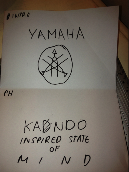
The YAMAHA + YAHOO briefs will allow us to explore the media mentioned above.

What specific design skills do you have to offer in relation to your chosen brief? How do you intend to use them?
I can offer my standard adobe suite skills (Photoshop, Illustrator and Dreamweaver skills) but I think my layout skills especially in InDesign will be useful for presenting our work.  Also producing grid systems for web briefs - I will apply my use of grids and guides to the web templates and hopefully structure the web grid systems.

I will also utilize my typography skills.

What specific non-design skills do you have to offer in relation to your chosen brief? How do you intend to use them?
I will also input a healthy amount of ideas and proposals with various creative directions.

I have an up to date knowledge of current events and awareness with what’s going both in the UK and Internationally.

I use the Internet and I am also familiar with digital media so this will help with deciding how we can use new digital media in relation with the YAMAHA brief and the YAHOO brief.

What will your specific roles be in this collaboration in relation to your brief?
I think Martin will use his technical software skills. I would say his skills within digital media are higher then mine, but I will contribute mock-ups and design ideas. Specifically I think my typography skills will be valuable.

What will your individual responsibilities be in relation to your brief?

What will your joint responsibilities be?
Presentations, idea genoration, research, time management.


Martin's agreement response:

Why have you chosen to work with your creative partner? What are your aims?
Sam has a professional outlook to his practice, recognising that graphic design is about clear communication and relies on the strength of a good concept. Sam has an eye for detail that I can sometimes lack, and works in a way that is different to my own, preferring a clean and sophisticated style of graphics that is counter to my normal approach to image-making.

What are your specific areas of creative interest in this brief? 
I am interested in applying technology and web design to this brief. I also have an interest in finding ways to promote other people’s brands in unusual ways, and both of these briefs should provide avenues for exploring this.

What specific design skills do you have to offer in relation to your chosen brief? How do you intend to use them?
I am familiar with the production of motion graphics and animation, and have been researching the potential of employing HTML5 animation to enhance web interaction for this brief.

What specific non-design skills do you have to offer in relation to your chosen brief? How do you intend to use them? 
I have an interest in technologies that are relevant to both briefs. In terms of the Yamaha brief, I have used their keyboards and am familiar with their range of musical instruments which will definitely be an asset to this brief.

What will your specific roles be in the collaboration in relation to your brief?
Sam's skills in layout and competence with type design will make him an asset for this side of the brief. He is skilled in typography and branding which could form a part of the project. I would like to contribute more heavily on the illustration, web and motion side.

What will your joint responsibilities be?
Presentations, idea generation, research, time management.


1o points about what we both agree on in relation to the brief and our ideology:

  • We think the Japanese philosophy should be included into the brief
  • Both concept driven
  • Efficient in design
  • Awareness of international design
  • Both have focused strongly on branding in the past
  • Both in to win the D&AD brief
  • Recognise design is about having fun as well as working hard
10 differences and me and Martin have:
  • Martin is mainly illustration image based.
  • Martin is a lot better at presenting 
  • I am more print based
  • Different ethical standpoints 
  • Martin is a vegetarian
  • Martin is from London
  • Martin doesn't use as much typography/ doesn't like it.
  • Different design taste
  • As people we are quite different