
Thursday, 18 April 2013
Responsive OUGD503 - Module Evaluation
OUGD 503 Evaluation
1. What skills have you developed through this module and how effectively do you think you have applied them:
I think choosing skills that suit you is a skill in its own right. Being able to turn briefs down is not a weakness but actually a strength.
If go into a brief with a negative attitude in my case this reflects in the design. You need an open mind a fresh start for every brief. An example I keep using is the web brief I got from a flat mates aunt, if I had taken the website on I would have suffered in the fact I now know I didn't have the skill set at the time to complete the website so that it would for example work on every browser. I think I would have struggled with the challenge and it would of taken too long to complete which in turn would of effected my other responsive briefs.
From the website brief I think I also learnt the importance of communication with clients. You need to be up front with clients and not be worried about being blunt. If your communication is reasonable and fairly polite, if they interpret you asking them for a deposit or agreed quote as a sign of being rude you don't want to work for them anyway. My communication has definitely improved. Another example of this is from the experience I did in Unwin print; I was originally really nervous about walking in a printers and asking if I could help. In the end it was a really valuable opportunity I grabbed and a new contact.
I always leave the presentation of my work to the last minute. But this module round I am really happy with the documentation and presentation of my work. Although blog posts can be improved the design boards I have created this time around are the best one I have done so far. I have adopted a style of presentation board while at the same time trying to create a interesting varying layout. I am extremely critical of my work and Ii am constantly trying to improve the boards I have created and still feel my boards could have been better. Still room for some improvement.
I think submitting work to YCN and D&AD gives you a feel for submissions and an understanding for the next time you have to submit. Obviously it is extremely important to follow the guidelines or you risk not even having your work looked at which is a massive waste of time for everybody.
I feel a lot more comfortable working within InDesign and also now enjoy producing booklets and especially printing within editorial design. This is from creating design boards in InDesign and other tasks such as the 'summative report'. I have been contacted by a publisher in Hong Kong called Victionary. I was contacted and given an opportunity to maybe be featured in their new book from the range called 'PALETTE' and the new title is going to be "Neon'. I am extremely excited about this and hopefully my work will make it in.
2. What approaches to methods of design production have you developed and how have they informed your design development process
I have improved the level of my design mock ups. This was mainly from proposal different forms of media for each individual briefs I started. The Yamaha brief forced me to mock lots of images that put our concept into context. Our final Yamaha work will need to be mocked up in this way so that it can be displayed on our personal blogs and websites.
Little things such as taking breaks and finishing on a positive note are becoming more apparent. I find if I leave a project on a negative I find it hard to begin working on it again.
Taking breaks for me is important and it gives me a chance refresh my thinking and look at the work with a fresh set of eyes. I generally pick up on things I could positively change after a break from the screen especially.
3. What strengths can you identify in your work and how have/will you capitalise on these?
I have been able to produce work for varying clients in this module as a result of doing a little freelance work. I think at this stage in my design practice this is useful as every client I work with gives me more experience. No matter how small the job there is still the communication process that takes place between myself and the client and maybe a printer which is extremely useful. Even if the experience is negative it is still positive in the long term. I guess this has influence the 'style' of work I have produced. I entered a design competition that require a T-shirt design to be produced. The way in which I interpreted the brief and began was different to what I usually did. I utilised my illustration skills more which at the time was a struggle as I was out of practice. In the end I came second and which gave me confidence to explore this further.
Strong print understanding
I feel my understanding of print has increased even though I have not done that much print work. I think working on live briefs raises questions that you don't address when the brief is self initiated. An example of this is how do you print the work you have produced someone in a professional way. You can run downstairs to the digital dungeon to print 120 invitations off and then cut with the studio guillotine. Well you can but it will probably look crap.
I think my understanding of layout has improved dramatically. As I was responsible for the Yamaha layout it required me to produced layout design along with type. I have become more interested in typography also and feel I have a stronger understanding of type. I haven't started designing my own typefaces but I can pick an appropriate font to use.
4. What weaknesses can you identify in your work and how will you address these in the future
I still left the submission of this module to the last minute? Why I have no idea. I will prepare myself better next time. I will make sure for a start that I have enough sleep. I will make sure that if there are any social events that could effect my productivity such as birthdays that I have enough recovery time to complete the work in advance of hand ins.
I need to plan my blog posts before I begin blogging. I think some kind of methodology when it comes to blogging is in need. I think I generally produce too many blog posts that are not annotated to a high enough standard. I need to be more specific and detailed. Quality not quantity.
5. Identify five things that you will do differently next time and what do you expect to gain from doing these?
Secret 7 - I always forget to enter this competition and if you are selected it is a great opportunity to get your work out there and receive some great feedback.
I will complete more competition briefs in general. If I have access to briefs that are generally of a higher quality then briefs I get from freelance, they are probably a better option for producing portfolio work. Also there is a chance of winning the brief which obviously bring with it the prestige of winning.
I will spend less time researching for my briefs but the research I do will be more productive and through. I spend a lot of time trawling the internet which in the end wasn't ticking any boxes and at the same time wasn't narrowing my information down.
I will organise my blog posts better. A technique I think will work is by making all of my blog posts before I begin a project. This means all I have to do is fill the blog posts with a high standard of research, development and evaluation. I will make sure all of my blog posts have consistent headings and descriptions. Overall they need to just be more consistent.
Tuesday, 16 April 2013
Sunday, 14 April 2013
Responsive - Yamaha Navigational Video
For the second stage of the video, we had to transition to a playing youtube video. This is quite hard to do convincingly. Martin had to download and embed the youtube video into the vector of the website so that it could be animated in the same movements as the static site. In the meantime, I worked on producing a vector of a youtube bar to accompany it.

This looked convincing, and Marton was able to find a way of animating the youtube bar so that it actually looks like the video is playing on the site. Even when zoomed in, it fits well in the video and simulates the real thing very well.

I made high-res screenshots of the other videos we wanted to use, and photoshopped the titles on to make them appear as genuinely unplayed videos.
Responsive - Yamaha Navigational Video

This is the share button and dialogue box that will pop up at the bottom of the navigational website. You will be able to share the responsive website in theory across multiple social networks.
Shooting devices.
To demonstrate cross-platform use of our website, we wanted to film hands interacting with the screen in different forms. I produced a long pdf of the complete site layout. Using this, we were able to open the file on mobile, tablet and laptop and use the college AV resource to shoot high quality, apple-inspired videos. We had to make minor adjustments in after effects. Martin altered the brightness and contrast to make the videos consistant and had to change the speed to fit the spaces we had allocated in the video.
It was actually quite difficult to film my hands interacting with the devices as it obviously wasn't a natural process having my hands filmed, every time I scrolled to fast or to slow we had to start again.


You can see the images are upside down. This is a result of filming from above.
Responsive - Teresa's Birthday Invitations
Printing


Finished Invites


Here you can see the invitations being printed. I went for a satin white finish. The invitation needed manual putting through the printer rather then doing a duplex print. I was really happy that I got them printed cheaper then if I use an online printers for example.

One of the main things when working within in print is trimming your print down to size. A really useful tool in the printers was an industrial guillotine. It made the difference between ammeter looking print and finish professional print.

Finished Invites
Back

Front

Friday, 12 April 2013
Responsive - Teresa's Birthday Invitations
The Brief
Teresa will be celebrating her 50th birthday in a few month and as part of the celebrations she needed some invitations producing that could be sent out in the post. Originally she wanted around 200, but she realised 120 would probably be enough. She is my girl friends mum so there was quite a lot of pressure to produce something that she would really like. She wanted the invitation double sided with one side being a full colour photographic print, the other side black type.
Before I started I had to think of printing cost of producing these invites as she didn't want to pay more an extreme amount on print costs alone. I thought I would probably pay for them as a gift to her.
Teresa really liked the idea of having bunting's on the photograph she provided for me and also she wanted a speech bubble saying 'Come to my party'. She also wanted a birthday hat illustrating in and maybe a birthday badge.
Here is the original image she gave me to work with.

Responsive - Unwin print
The Brief
I did a couple of days in a print shop called Unwin printers, from this contact I was able to get a few design jobs from Martin the owner. Although the jobs were small and I really didn't like the style in which I was working I think it was valuable to get in the mind set of doing work for clients and not for yourself.
The brief was to create a flyer for a local removals company called RighMovers. Martin sent me their original flyer that they were currently still using.

The flyer would be digitally printed so although there wasn't a need for multiple colours it was possible to experiment. It was a really small brief which didn't require hours of concept work instead it was just needed a new layout.
It was also open to me if I wanted to keep the image.
This website needed to go on.
Here you can see a few screen shots of the RightMovers website:


Final Design
This is not a piece I would put in my portfolio in a million years, but it did fulfil the purpose and live briefs and the client was happy with it.

Saturday, 6 April 2013
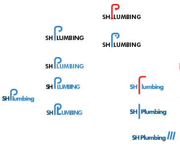
Responsive - SHplumbing Branding
The brief
I was asked by a close friend if I could make him a logo as soon as possible for his plumbing work. He wanted something that looked fairly corporate but at the same time stood out.
He wanted a blue colour scheme and the following details on the business card.
Business Card
Front
SHplumbing
Back
Sam Hedley Plumbing
s_hedley@hotmail.co.uk
+44 (0) 7939 980464
All in all it was a really simple job. Sam said that he would like the logo on a letterhead and also on a business card if possible to keep a consistent theme. He would be using the letterhead as an invoice page which would need to be transferred onto a microsoft word document. This was actually the hardest part of the brief; I have never actually made a letterhead that is editable on a word processor so I have to research the easiest way of getting the work from Illustrator to word.
Development


Business Cards


Letterhead

I was asked by a close friend if I could make him a logo as soon as possible for his plumbing work. He wanted something that looked fairly corporate but at the same time stood out.
He wanted a blue colour scheme and the following details on the business card.
Business Card
Front
SHplumbing
Back
Sam Hedley Plumbing
s_hedley@hotmail.co.uk
+44 (0) 7939 980464
All in all it was a really simple job. Sam said that he would like the logo on a letterhead and also on a business card if possible to keep a consistent theme. He would be using the letterhead as an invoice page which would need to be transferred onto a microsoft word document. This was actually the hardest part of the brief; I have never actually made a letterhead that is editable on a word processor so I have to research the easiest way of getting the work from Illustrator to word.
Development


Business Cards
We decided on this this business card.


Letterhead

Subscribe to:
Comments (Atom)