Tuesday 11 December 2012

Mutton Quad - Designs


I think I am going to use this logo.  I made the tracking smaller and also included the macron Ë. The macron E is sued internationally which I like the idea of. My restaurant will also serve international foods from around the world so the E has context being present in the logo. 

I also decided to use the fork in the logo as the link between Kerning and the fork prongs being oddly kerned was a reference I had to use. The restaurant being  typographically themed. 

I am not set on a colour scheme yet so this will probably change. I am just trying to get a feel for what might work. 

Monday 10 December 2012

Mutton Quad - Designs

I started off creating the fork for the logo. I traced a fork which I found online and realised it basically looked pretty lame. I then designed my own fork using circles to get a perfectly symmetrical curve. This fork looked more professional and it also left me with the option to manipulate the dimensions more.


I then started working on some layouts and applied some text to the logo. At this point I felt like giving up. I decided to run with the idea of a restaurant called Kern which is technical typography terminology for the spacing between each character.


KerningFrom Wikipedia.In typography, kerning (less commonly mortising) is the process of adjusting the spacing between characters in a proportional font, usually to achieve a visually pleasing result. Kerning adjusts the space between individual letter forms, whiletracking (letter-spacing) adjusts spacing uniformly over a range of characters. In a well-kerned font, the two-dimensional blank spaces between each pair of characters all have similar area.The related term kern denotes a part of a type letter that overhangs the edge of the type block.


I continued working on the logo and it started to look better which gave me the confidence to continue with the idea of naming the restaurant Kern.


More examples and designs.


I like this but I think its quite a simple generic design.

This is more what I am thinking. I don't know why I used the two dots above the letter Ë, but they give the logo something visually. I am going to change this because I know it probably doesn't make sense and serves no function. I am going to replace it with something that makes sense.


I started applying a colour scheme to the logo mock ups I have produced. It makes a big difference to the feel of the logo once a colour scheme has been applied. I think if you can make the logo look good in black it will look even better once a colour has been applied to it.


More examples I am fond of. I am going to ask people in tomorrow crit what they think. I have printed off all the logo mock ups and I am going to ask them to choose two logos on the sheet with an explanation.


Example of a different coloured background.


Example as a letterhead.


When I have picked a logo I will do a mock up showing how the logo and brand will look across a range of products, including the exterior of a shop front.


Thursday 6 December 2012

Ethical Gold - Finished website

Landing page (home page)


About page, thus page has the contact information on too. I am a fan of the less pages the better.


Suppliers page. This page has an interactive google map which I pinned all the certified ethical gold companies in the UK. If the site were to go live I would add more but for the purpose of this brief I only added around eight.


The news page. This page illustrates the scroll function which shows the content going off the page from top to bottom. The content goes under the buttons and over the ethical gold logo.

I am really pleased with what I have achieved in web. This is the first website I have designed and coded. At first I didn't think I was going to be able to translate the design into Dreamweaver and make it functional. I had to compromise on a few things, for instance newsletter page and the interactive draggable contact circle that I wanted to float about every page.

I think visually the website is aesthetically pleasing and fulfils is purpose which was to inform someone looking to buy ethical gold in the UK. I think the user would not have a problem navigating the website and would quickly be able to find a company to buy gold from. I think the idea of having ethical gold companies all in one place online is a good idea too as I found it laborious searching for them myself.


Wednesday 5 December 2012

Five things - Lorraine 2 lesson

5 ways the audience may interact with or come into contact with your work

  1. Online through networking sites such as twitter, Facebook
  2. Online directories
  3. Website for the restaurant
  4. Posters, flyers for the restaurant
  5. Passing by and seeing the exterior
5 things I still don't know about my chosen subject
  1. What my menu is going to consist of
  2. What is my content
  3. Where is my restaurant going to be located
  4. What specific forms of media am I going to use to advertise
  5. What my visual identity is going to look like
5 problems that you need to solve and why do they need solving
  1. I need to find a visual identity because this is the main point of the brief. I haven't started designing as of yet.
  2. I need to define the bulls eye target audience that will appreciate my concept for a restaurant. This will give me an starting point in working out how I am going to design for them without excluding general members of the public that are not in the bullseye target audience. 
  3. I need to define the purpose of a restaurants website? Why do restaurants have websites? is it solely for contact information and online interactive bookings?
  4. How am I going to present my final work? Is it going to be a booklet or a set of presentation boards etc...
  5. Am I going to try and incorporate a mock up restaurant so that my products can exist in that environment as a concept.

Tuesday 4 December 2012

Mutton Quad - re-written brief

The Brief
Create the branding for a typographic themed restaurant, with typography that is not only visual that permeates all aspects of the place.

Considerations
  • How will you make dining out an experience 
  • How can you brand a typographic themed restaurant?
  • How can you make dining out successful?
  • The complexity + culture behind typography
  • The purpose of typography
  • Typography to non-typographers, non-creatives
  • Typography being written speech

Background
It may be a business lunch, dinner for a special occasion or lunch with the family.

Target audience
People in the creative industry, typographers, graphic designers and the general public. 

Tone of voice
The tone of voice should be professional but relaxed.

Mandatory requirements
Research and development (on blogs and design sheets)

Show us the use of design techniques (grid systems etc)

Mock ups

Presentation (booklet)

Deliverables
  • Restaurant
  • Signage
  • Interior
  • Exterior
  • Website
  • Flyers
  • Business Cards
  • Lighting

What am I going to do?

Audience
I have decided that I am going to base my branding at typographers and type aware creatives; this is a very niche and specific market and audience for a restaurant, but my idea behind this is although the restaurant will be branded for this audience specifically it will not exclude non-typographer. 

I want typography references to go un noticed to the un trained eye but create that industry specific, insider understanding. It will be like a game to the typographer to find all the terminology they might use each day.

Example, the name of the restaurant could be Kernin, an obvious type reference to a creative and someone who doesn't understand are not going to be out raged because they won't even realise.

This will fulfil the part of the brief that mentions 'permeating all aspect of the restaurant.'

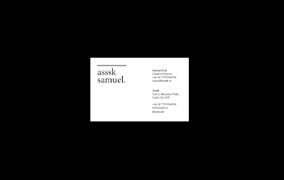
What am I going to deliver?
I am going to create a menu, signane, letterset for the walls and windows, business card and a letterhead and maybe a set 

Five things - Lorraine

Lorraine's task to help us re-write our chosen brief. We picked 1/3 briefs, I picked the Mutton Quad brief. For tomorrow I need to produce a proposal of what I am going to do.


Five problems I want to solve.
  1. Create a niche typographic restaurants
  2. Make dining out an experience 
  3. How can typography permeate all aspects of the restaurant?
  4. How can you brand a typographic themed restaurant?
  5. How can you make dining out successful?
Five reasons you want to solve it.
  1. Because I don't think there are many typographic restaurants
  2. Because I love dining out, especially at a restaurant I approve of
  3. It would be interesting going to a restaurant and finding typography specific references throughout the experience
  4. I like branding
  5. Because that is an interesting question that many people have searched for the answer to
Five things you don't know about your brief.
  1. Typography references, hobbys, connotations, style, interest
  2. Restaurant media, format
  3. Food that typographers are interested in, whats the menu
  4. What else other then typography makes restaurants successful 
Five facts you know about your subject/ content.
  1. Food industry is huge, people gotta eat!
  2. Typography should permeate all aspects of the place
  3. Every aspect of food, its production, delivery, purchase and preparation is analysed, theorised, visualised and criticised.
  4. Restaurants offer different environments to dine in.
  5. Themed restaurants have always existed
Five facts about your audience
  1. Enjoy detail, attention to detail
  2. Probably enjoy typography jokes
  3. Whats green and loves typography?... Kern-it the frog!
Five end products
  1. A menu - which is designed with the intentions of merging food and typography. The language needs to mimic typography terminology.
  2. Window vinyls - Restaurants generally have attractive window typeset vinyls which I would love to apply.
  3. Wall typeset - Visual typography on the walls, for instance a typographers kind of joke.
  4. A bit of a silly idea but some kind of process that makes sense and functions well. For example when you order your food you have to fill out a form that specifies exactly how you want your meal cooked. An over the top typography reference.
  5. A fork that isn't kerned properly! cutlery that is linked to typography.

5 points of distribution  
  1. Restaurant
  2. Signage
  3. Interior
  4. Exterior
  5. Website
  6. Flyers
  7. Business Cards
  8. Lighting
Five ideas you wish to communicate
  1. The complexity + culture behind typography
  2. Although typography is generally invisible, this is for a reason
  3. Typography to non-typographers
  4. Typography being written speech

Monday 3 December 2012

Life's a pitch - Branding

Now we had more of a solid brand in place and a clear concept of how we want our presence to look across a number of channels, we decided as an initial task, to create our own stationery. This is, of course, one of the most important tools to have. A business card is first impressions and can help lead to a job opportunity or not and a whole set will give our brand a clear identity.


Sam had a look at what the business card might look like and came up with some initial ideas with the guidance of the group.

Our plan was to emboss all of our stationery to give us that extra aesthetic edge to potential clients...

Business Cards:


As for the reverse of the card, We wanted to keep this relatively simple. We all agreed that the idea of having a name underneath 'asssk' would be beneficial because it would add a much more personal touch to our business. Our main objective was to connect with our target audience of a really personal level. by having our names on there, it initially make the person feel like they are able to give us a cal or email and we'll happily speak with them. 


Envelopes:


Seb did the envelope designs. We decided to use this repeat pattern that he created throughout our stationery so our colour scheme would be black and white and the salmon pink colour throughout. 

We made a change to the e-flyer by changing the main colour to mint green. We felt it gave us a more iconic style and differentiated us from a little more.

ISTD Briefs


Pretty certain I am going to do this brief simply because I like branding and I think I can apply my own theme to it within the brief. I have a clear picture in my head what I am going to do. Basically my ideally branded typographic restaurant.


I feel more inclined to do this brief because there is more of a theme that I am interested in. Imbalance is and interesting concept.


I am probably going to do this brief. I have some ideas in my head and the fact that it is an event that would have distribution and and a target audience gives it some purpose and I feel it would be easier to design around those constraints then without them. 


Sunday 2 December 2012

Life's a pitch - Branding / Mock website


Life's a pitch - Branding / Letterhead

Seeing as we have done the e-flyer and are ready for mondays proposal, I started working on some letterheads. It is good to get a feel for how the logo translates across a range of media. The logo is an anbigram so I wanted to incorporate this into the letterhead too.


I prefer simple letter heads.


We are planning to emboss/de-boss the letterheads. so all the designs here with the compositions I have done could be just embossed without the solid black fill.


Black, patterned back. Seb said he is going to do the envelope and maybe come up with a repeat pattern which could be applied to the back of the letterhead.


This would show the logo being a anbigram.