For the stamp brief I started off by illustrating endangered animals. I used ink and water
to create different shades and tones. By scaling down my original
scanned in images I found that the drawings gave them a higher level of
detail. I rendered them off the white stock I used which made them feel a
lot cleaner to look at.
I tried to mimic a Chinese/ Japanese ink painting style. I found
inspirations in the ink paintings and wanted to try something different.
As I have highlighted throughout the year I want to continue to try
different media, stock and techniques to become a contemporary designer
who can produce any 'style' of work. This means that I have to find new
inspiration all of the time.
I brain stormed and by categorising it usually informs
me of the approach I am going to take. Then I started gathering primary
and secondary research from different blogs and web sources.
For 'Communication Is A Virus' we
decided to choose How to be creative/ recycle.
We thought of an idea we could run with pretty much straight away. I was carrying a 'juice purse' on my person and when I said we could make juice wallets and purses everyone took it with a pinch of salt until we pondered over it more and decided that we could in fact brand and create and identity for juice purses created out of juice tetra packets.
We thought of an idea we could run with pretty much straight away. I was carrying a 'juice purse' on my person and when I said we could make juice wallets and purses everyone took it with a pinch of salt until we pondered over it more and decided that we could in fact brand and create and identity for juice purses created out of juice tetra packets.
I
was given my juice purse as a small gift which cost nothing and
anyone in theory could make. The juice purse is just quite a catchy
little quirky purse. We thought that they were perfect as a concept
to sell.
We
did some research online and found that although their were different
template nets their wasn't any kind of brand that visible to us. So
there was an opportunity for us to be the first to brand the juice
purse tetra packs. We thought that juice purse answered the brief by
being something a bit different that also followed 'How to be
creative while recycling'.
Although
we didn't find anyone else who had branded juice purses we did find
other Eco business's that were doing the same thing with different
products for example Ecoist, tree hugger, great green good and many
others. These company's have a set of products that are made from
recycled items such as coco cola cans and made into hand bags and
other sorts. This identified to us that theirs definitely a market
and an audience for this type of product which gave our idea
credibility.
We
started off making loads of juice purses from which we found
quantitative templates and got quite a lot of primary research from
different members of our group and also people from around college
generally other students. What kind of existed as a gimmick in our
minds seem to impress people. So we began secondary research of what
makes a successful brand and trying to create a brand for Juice
Purse. Juice Purse was also the name we decided to use as it made
sense by directly describing the product as well as being a tag
online for the tetra template which made sense as we thought this is
what people would usually use as a search term through a search
engine.
We
found looking at any other contemporary products which are sold on
the internet serves as good secondary research for branding and
identity. We looked at websites and products we thought worked and
ones wee didn't and we discussed in a group why and how they were
successful and unsuccessful in our opinions. This was useful as it
gave us a bench mark for our own product. We considered the amount of
resources we had at our disposal and also the amount of time we had
on hand which would directly effect the end result of what
realistically we could achieve.
In
the final crit promotion was raised. According to Jo and Amber we
needed to promote our product more as the concept and the way we had
approached branding the product was great but unless we physically
got it out into a live context how would people know about it. From
there we decided to make a Facebook page and twitter page in which
people could view the Juice Purse.
I
think the group worked really well as a whole and the product and
work we produced was very successful. Juice Purse has been one of my
favorite briefs. I think it was enjoyable because we tried lots of
new things for example the video and also the homemade embossing.
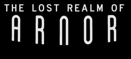
I still need to book print slots earlier so that I am not struggling to print. When
printing in college it is a good idea to book in advance which I did for most of this module. Luckily this didn't effect me
massively but it still impacted my work slightly. I would of liked to have printed my Middle Earth poster bigger and with a silk satin stock. This made my map slightly faded because of the paper I used. In the future I will
make sure that I am prepared for anything and that I have sufficient
time in the printing rooms.