Monday 26 March 2012

Evaluation

I generally start off by evaluating the problems within briefs by identifying the audience and how best to communicate to their needs. I also identify how long the brief is and what I can do realistically. There's no point embarking on a huge project that's going to be rather pricey when the brief is only two weeks. The problems being solved is what drives the the concept.


When investigating the brief I first start off by finding existing imagery that has been created. This gives me an idea of what people have done and also what I find interesting when I see existing work for the same concept. First impressions of other peoples work informs me on what works and what doesn't.   

If what I propose to do doesn't actually exist, which is extremely rare if I find similar ideas and existing work. 


I do a lot of blogging and re blogging specifically to surround myself in visual imagery so that I can find inspiration. Again primary and secondary research. Using surveys to collect primary data which I then sort. Sometimes this method of collection works sometimes it doesn't. I think as the year has progressed people have become more reluctant to fill out surveys.

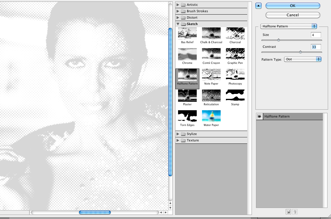
This was primary research which involved me printing off different halftone frequency's and silk screen printing them to see what was possible. I was looking for a print that was as photo-realistic as possible. I have put a lot of effort in the 'What is a line?' brief and hopefully the end results will reflect this.


Stamps
I started off by illustrating endangered animals. I used ink and water to create different shades and tones. By scaling down my original scanned in images I found that the drawings gave them a higher level of detail. I rendered them off the white stock I used which made them feel a lot cleaner to look at.
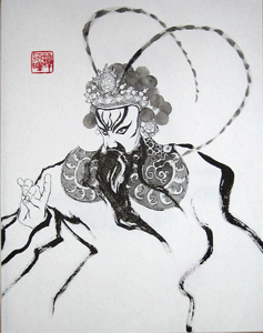
I tried to mimic a Chinese/ Japanese ink painting style. I found inspirations in the ink paintings and wanted to try something different. As I have highlighted throughout the year I want to continue to try different media, stock and techniques to become a contemporary designer who can produce any 'style' of work. This means that I have to find new inspiration all of the time.

I started off by brain storming and categorising which generally informs me of the approach I am going to take. Then I started gathering primary and secondary research from different blogs and web sources.


I just decided that it was endangered animals I wanted to focus on because I felt the brief offered a predictable response which would be to run with saving water, energy efficient light bulbs, solar panels and other obvious solutions. I came to this decision I think because we focused on recycling on the last brief which was communication is a virus, how does it spread - recycling, Juice Purse. This was a wrong way to go with when I think about it now and I think I could of answered the brief better.

Tuesday 20 March 2012

What is a line?

Chosing a typeface:
Code Light
Code Bold
Chaparrel Pro
Courier New
Euphemia UCAS
Futura BK BT
Letter Gothic STD
Sathu
Kozuka Minchopro

There Will Be Blood
 Road To Perdition
 American Psycho
OldBoy
Blade Runner

Design sheet


Stamp it //Stamp Development

With the illustrations I have done 


Friday 16 March 2012

Stamp Crit

From the crit I became aware that dinosaurs would not follow the brief as they were not specifically British. Instead of illustrating dinosaurs I am going to illustrate endangered British animals.

Examples
Wikipedia 

Mammals
Bottlenose dolphin Tursiops truncatus, warm and temperate seas worldwide
European Hare Lepus europaeus, northern, central, and western Europe and western Asia
Hazel Dormouse Muscardinus avellanarius, northern Europe and Asia Minor
European Otter Lutra lutra, Asia, Africa and Europe
Greater Horseshoe Bat Rhinolophus ferrumequinium, Europe, Africa, South Asia and Australia
Harbour Porpoise Phocoena phocoena, coastal waters in the Northern Hemisphere
Red Squirrel Sciurus vulgaris, Eurasia
Water Vole Arvicola terrestris, Great Britain, northern and central Europe and in parts of Russia

Birds
Aquatic Warbler Acrocephalus paludicola (passage migrant through UK)
Capercaillie Tatrao urogallus
Corn Crake Crex crex - globally threatened
Eurasian Wryneck Jynx torquilla
Great Bittern Botarus stellaris
Grey Partridge Perdix perdix
Red-backed Shrike Lanius collurio
Skylark Alauda arvensis
Song Thrush Turdus philomelos
Reptiles
Slow-worm Anguis fragilis, Eurasia
Sand lizard Lacerta agilis, most of Europe and eastwards to Mongolia
Common or Viviparous lizard Zootoca vivipara, Europe and Asia
Northern or European adder Vipera berus, Western Europe and Asia
Grass snake Natrix natrix, England, Wales and mainland Europe
Smooth snake Coronella austriaca, northern and central Europe, Middle East

Amphibians
Great crested newt Triturus cristatus, Europe and parts of Asia
Natterjack toad Bufo calamita, Northern Europe

Fish
Allis shad Alosa alosa
Pollan Coregonus autumnalis pollan
Twaite shad Alosa fallax
Vendace Coregonus vandesius
Gwyniad Coregonus pennantii

Other species
Bees
Beetles
Butterflies and moths


4 Species I think I am going to illustrate.
Hedgehog
Water vole
Hazel dormouse
Western Capercaillie

Stamp brief

I think I am going to create a set of dinosaur stamps which would symbolise extinction. I want to scan in some illustrations from children's books and do some ink drawings from them. I definitely want to use ink as the medium. 

I really like the Japanese style of ink drawing. 


Tuesday 13 March 2012

What is a line? Experimenting // Blade Runner

I have been trying different compositions and different frames. I introduced a title at the bottom just to get a feel of what it might look like. I'm still trying to find something that look right on the page


What is a line?

Halftone Experiments
Dot Size 4
This is the original image. (Joanna Cassidy looking ravishing in Blade Runner)
I saturated the image a bit more I don't actually know why I did I am just trying to see what works best with the halftone effect.

Filter> Sketch> Halftone Pattern
Here you can see the I set the settings to Size 4 + Contrast 33, Pattern type Dot because I want to silk screen this image.

This is the effect I got. I thought from looking at tutorials that the remainding dots would be black but it looks as if the transparency is down. I dont know why this is but I used the Brightness + Contrast adjustment to darken Joanna! See below this image.


This is the final Image I came up with.

Juice Purse Video


Final Juice Purse video. Edited and filmed by Simon Isles, featuring me and Sam Lane.

Juice Purse - Presentation Board

Here are the presentation boards that Ross made. We presented these to Amber and Jo and they were really into the idea.


Friday 9 March 2012

The Video //Communication is a Virus.


Simon Isles is an absolute beast at filming and editing which we have now found out. Really happy with the video we have made documenting the process and making a juice purse along with the embossing of the business card.

The video will appear on our presentation and also on the concept website.

The soundtrack is Bonbon - magic man

Marking the juice purse template

Cutting and scoring the juice purse from the template

Folding the juice purse
Printing the business cards
Laser cutting the JP type which embossed when pressed the business cards
The laser cutting the type
Cut out type
Entering the print room to emboss
Lining the type to press
Pressing the laser cut type onto the business cards
Stock - Water colour paper
Nice little zoomed out shot
Pressed and ready to go!
Juice Purse with buttons