Tuesday 29 November 2011

Laser cutting

Fairly simple designs but when they are cut using the laser cutter they look really good. I have already cut some of these out on the laser and its really satisfying when you can physically hold the typography. I really need to take some pictures of the ones I have already made. I gave my mum this one for her freshly decorated living room:


Just been watching documentaries and reading up a bit about the American economy and how America borrows billions of dollars a day and its annoys me how generally the country over consumes and wastes so much. So in the heat of the moment I put some typefaces together!


Monday 28 November 2011

How to take a punch!

RUN
ROLL WITH THE PUNCH
PROTECT YOUR CHIN + TEMPLE
OFFENCE IS THE BEST DEFENCE
BREATHE

The hands I live traced from an existing image
http://www.drawcomics.net/how-to-draw-hands.html
I think I will draw them myself.

Tuesday 22 November 2011

My new digital signature. I don't actually use this to sign for anything by the way.

Monday 21 November 2011

End of Module Self-Evaluation OUGD403

  • What skills have you developed through this module and how effectively do you think you have applied them?
I started off using new improved skills when I used Illustrator to create my three posters. I traced images directly using the pen tool instead of hand tracing images and digitally rendering them. The effect looked a lot better for what I wanted to do. 

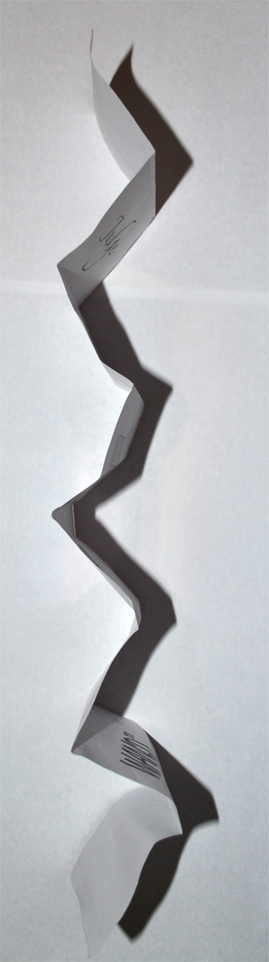
I'm really glad I have taken advantage of the laser cutter. Luckily I decided to get involved and have an induction which meant I was able to use it in my proverbally yours brief and made a set of stamps.

Having a specialised printing room on the bottom floor has made me more aware of the stocks that work well with my work and I think this skill of selecting different stocks has improved. I now think carefully with an open mind about what I am going to print on before I print it.

My typography skill has really improved. Before I came here I had not done any work related to creating typography and even though I think my typeface briefs could be improved I am still satisfied with what I have produced. 
  • What approaches to methods of idea generation have you developed and how have they informed your design development process?
I think using design sheets and creating a grid with quick ideas works really well as you are able to select your favourite designs and develop them further instead of just focusing on a few designs and creating them to a final piece. I also think working on paper and blogs works well for me as sketchbooks feel restricting.
  • What strengths can you identify in your work and how have/will you capitalise on these?
I think my work is all different, meaning I have experimented with different styles, colours, formats, media and stocks. I have tried to do new things creatively. I will capitalise by continuing to create new things and explore new ideas.
  • What weaknesses can you identify in your work and how will you address these in the future?
Usually once I have developed something further from a set of idea's I find it hard to re-visit work and re-design. I think this is a mixture of being slightly lazy and also not wanting to change the design because I personally might like it. 

I am going to force myself to re do work if it is not to the best standard along with not jumping into an idea without knowing I have exhausted my design sheets.
  • Identify five things that you will do differently next time and what do you expect to gain from doing these?
I will do more design sheets, development and experimentation which I think will make my design more dynamic, creative and generally more interesting.

  I will do more contextual research when I am designing so that I am more informed in design. So far I have been blogging lots of different design I like but not utilising it when doing my own practice. I think this will make my work more professional. 

I am also going to try and interpret the briefs differently in a way which will allow me to be more creative. Trying to read between the lines I guess. When I read the brief sometimes I panic without reading it properly without understanding what potentially I could do.

I will re design different pieces of work I create in the future to see if they can be improved. I think this will improve my design as developing ideas will create better design and if it doesn't then I will not have lost anything.

I will organise my time more efficiently. I think this will allow me to create more work to a higher standard; example, booking printing slots in the prints rooms so that I am not panicking about printing my work.

Thursday 17 November 2011

ENMESH


Just an idea I had for a T shirt. There needs to be some kind of fill or something just above the brain. If anybody wants to play around with it let me know.


Proverbally Your - Message & Delivery

Here are my posters in context - context being college as I think the audience of college would fit the purpose of the posters well. Originally I wanted to take the posters in an old peoples home but after realising this wouldn't be possible and also that it wouldn't actually fit the intended audience I decided college (mosaic cafe) would be a lot more appropriate.


Colour Theory lesson 1

We started off by sorting through the different variations of violets. The task was to start sorting them into a colour wheel.

This is the whole colour wheel after we all arranged the colours. Ours went from light violet to dark violet and then to light violet pink joining the red group to the right.

We then had to then sort the 10 colours into Tints, Shades, Hues and one primary colour or the most vivid violet we could find. After we did this we had to find the PANTONE colour codes. Wikipedia - "The Pantone Colour Matching System is largely a standardized colour reproduction system. By standardizing the colors, different manufacturers in different locations can all refer to the Pantone system to make sure colours match without direct contact with one another"

This is important as you can end up spending a lot more money on printing if the prints are not the colour you thought you were printing. Accidental colour variations could effect costs also as some colours are more expensive then others, combinations of colours etc.


Colour wheel:


ADDITIVE and SUBTRACTIVE COLOR
There are two basic colour models: Additive colour and subtractive colour. Additive colour involves the mixing of coloured light. The colours on a television screen are a good example of this. Additive primary colours are red, green and blue.
Subtractive colour involves the mixing of coloured paints, pigments, inks and dyes. The traditional subtractive primary colours are red, yellow and blue.

I didn't take the notes in the lesson so I got the colour wheel and subtractive and additive colour theory and images from Art factory.


The PANTONE colours codes for the colours we had.
PANTONE colour guide.

PANTONE fave colour.

AMIGOS tequila beer. Taste nice and also I love the design. The green and red complement each other and also the gold works with the two. The greenhouse effect in Amsterdam uses a lighter green with gold and the green would be my favorite colour but it has to co exist with the cream, gold and black, because of this I decided PANTONE 200 C is now my favorite colour.
Looks at that red.


Colour Theory lesson 3

Colour Theory PDF

Colour Theory - This shows how different background colours can effect how colours appear. Black for example joins with the colour on show and makes it part of the background.

If you scroll through the images I have taken you with see how the colours change according to background.

Red appears more brilliant against a black background and somewhat duller against the white background. In contrast with orange, the red appears lifeless; in contrast with blue-green, it exhibits brilliance. Notice that the red square appears larger on black than on other background colors.

Colour Theory lesson 2

Complimentary colours and Extension of colour. This is how colour appears when placed next to other colours. Images re-blogged from Simon Isles.


We took these as a group to show varying contrasts.


http://www.colormatters.com/color-and-design/basic-color-theory
'Primary Colors: Red, yellow and blue
In traditional color theory (used in paint and pigments), primary colors are the 3 pigment colors that can not be mixed or formed by any combination of other colors. All other colors are derived from these 3 hues. 

Secondary Colors: Green, orange and purple
These are the colors formed by mixing the primary colors.

Tertiary Colors: Yellow-orange, red-orange, red-purple, blue-purple, blue-green & yellow-green
These are the colors formed by mixing a primary and a secondary color. That's why the hue is a two word name, such as blue-green, red-violet, and yellow-orange.'

Wednesday 16 November 2011

Fuck Your Eyes

Sorry this was a test. It actually makes me feel sick, no shit.

Friday 4 November 2011

Proverbally Your - Message & Delivery

My profession was Wizard. Task - Design a mail shot that distributes, disseminates and reinforces your message to an appropriate list of recipients.

I started off by linking 'Don't judge a book by its cover' and my profession - 'wizard' together. Luckily the two almost go hand in hand.
Mind Map:


Creating imagery associated with Wizards. We focused on semiotics. I simplified the imagery that is associated with wizards as much as I could. Some things as simple as they were to draw were harder to simplify without taking away the legibility. I like the beard image and the angle I drew the hat. I think I will experiment with this image on Illustrator.
Design sheet 1:
Design sheet 2:

I then started off by thinking of the content and format. I decided that my mail shot is going to try and be slightly humorous but with a point. The point being some kind of event which doesn't stereo typically carry connotations of wizards for example Scrabble tournaments. 

I think I have decided on a Constantina style pop out invitation. Here is the first mock up:
Second mock up:


Possible fonts:
Zapfino
Brush Script
Channel left slanted
Duke
Franchise
Handwriting - dakota
Mailart Rubber Stamp
Reklame Script


I have done some research looking for wizard fonts but there isn't really a set style which leaves it open to me. I think I will have to create my own understanding of wizard typefaces. When I think of wizards I think of a traditional typeface. I don't want to just settle for a script style so I'll test a few and see how they look on the page.

Google image:

For the back of the invitation I am going to have a wizard with his beard going all the way down to the bottom.
Some designs:
 
I decided to choose this one because it fits on my format and when I asked people which one they thought looked the best and was most legible they selected this one:


I am going to seal my envelope with wax and I am going to create a wooden stamp. My flat mate said hes got a wood grinder or something so I need to get some wood and experiment.


Although these are pieces of jewelry you get an idea of the wax stamp seal design.


I did a few design mock up of logo that would work on the stamps:


Here is the first stamp wood carving. I used an engraver in the end to cut the stamp face out, this took a very long time to do and was very laborious.
Door stop:

Today I had my laser cut induction which I had forgot about to be honest.  I am going to re-do my stamp's with the laser cutter which will allow me to do any design within reason. The laser cutter will do it more accurate, faster and to a better finish then humanly possible. I am going to use the the stamps below over the star within a circle stamp because I think the star doesn't really carry connotations of magic and wizardry, instead to me it represents a sort of satanist, black magic image.

Here are the example of my stamps:

The top two stamps were my first attempts which were on 9mm MDF. When I started off making the stamps on the laser  cutter I wasn't sure how deep they would actually cut, the technician told me it probably wouldn't cut. I tried different widths of MDF and finally with the last two I managed to cut through. I stuck the bottom two with another two uncut circles; the laser cutter doesn't engrave deep lines so this was the only way I could get a deep engraving.

Here are the stamped wax seals:
The technique of stamping is quite difficult. Once you have your stamp and you have your wax which I bought in the form of a candle from Ebay:
You have to melt the wax onto the area you want to stamp making sure the surface area is a sufficient size for the stamp. If your stamp is not made of brass you need to oil it so that the wax doesn't stick to the engravings of the stamp. I used olive oil to do this wiping off excess oil. You then let the wax cool slightly, wait approximately 10 seconds and then stamp the wax and hold the stamp down for another 10 seconds. Gently peel the stamp away. I found it was hit and miss getting a good quality of stamp.


Here are the final designs for my Wizard/ Proverb task:
Back of the fold out

Front of the fold out
Here you can see it once it has been folded up:

I created my envelope myself. Instead of hand drawing it out with pencil which I saw a few people doing I decided to just turn the opacity down on the envelope lines. When the envelope is printed you can hardly see the lines especially as they fall on the folds.

When I printed the envelope for the first time I set the opacity to 5% which showed up on screen but when printed didn't show up. I changed the opacity to 10%

Mail shot