
Poster 1 - Mortality statsThis poster shows mortality stats in the UK.

Creating a star with rounded corners. This is for the title

Here you can see I rounded the corners and duplicated the layer. After I rotated one of the layers it gave me this shape.

The circles represent UK deaths proportionately to their size. The cannabis circle doesn't exist because cannabis death to intoxication does not exist!
Trying to keep the graphic clear and simple. Showing the stats clearly. I think the figures speak for themselves and I don't really need to elaborate much on the poster.
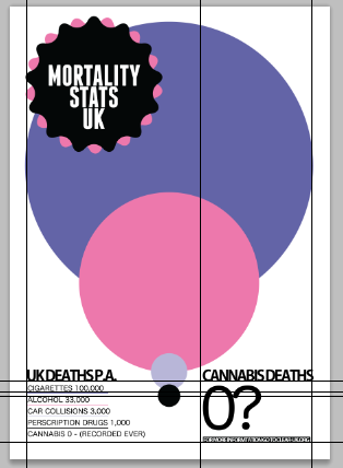
Trying to keep the graphic clear and simple. Showing the stats clearly. I think the figures speak for themselves and I don't really need to elaborate much on the poster.

Without the guides and what I'm taking to the printers. I'm unsure of the UK on the top left 'mortality stats UK' might get rid of the whole thing or have a play around with it. I will sleep on it.
Poster 2 - Mortality stats
Poster 2 - Mortality stats


I started messing around with the Spiral tool in illustrator but working it out so that the spiral looked right was difficult. Getting the decay and segments in proportion was the trouble. The spirals represent mortality in the UK. Ive chosen to represent tobacco, car collisions, prescription drugs and alcohol deaths comparing to cannabis intoxication deaths (which are none).

I then used the pen tool to draw a line which links to the figures.

This is the final so far.

Medical Cannabis - House of commons 9th May 2011
Started off by getting some sort of layout down from my design sheets. I am trying to present the discussion that took place on the 9th of May in the house of commons.
Started off by getting some sort of layout down from my design sheets:
The poster needs to fully show the debate that took place but it also need to be clear. The poster has to be somewhere that people can take the time to stop and look at it because of the nature of the information being communicated. Personally I would stop and read it but thats because I am interested in medical cannabis and politics. This poster could also exist in different contexts such as the internet.

Started of using lines of varying thicknesses to grid the body of text I was showing. The point size of the typeface varies according to the amount of text. The less text the bigger the point size.

I used the same logo I used on the mortality stats but got rid of the text and added a downwards arrow. This arrow acts as a visual aid to navigating the poster. I think this was necessary to brake up the amount of text on the poster.

I created the Sativex logo on illustrator. I traced over a spray I found on Google using the shape tools and re-shaped the shapes to look like a Sativex oral spray. Although it isn't exactly the same shape as a bottle of Sativex. I think it does the job to be honest. Only Sativex patients might notice these subtle differences. My apology's.

Here is the final thing. As you may have noticed, after proof reading my posters and then printing them. Greta informed me that I had put 20011 instead of 2011 in the main title... Probably need to work on my proof checking.


No comments:
Post a Comment