
My profession was Wizard. Task - Design a mail shot that distributes, disseminates and reinforces your message to an appropriate list of recipients.
I started off by linking 'Don't judge a book by its cover' and my profession - 'wizard' together. Luckily the two almost go hand in hand.
Mind Map:
I started off by linking 'Don't judge a book by its cover' and my profession - 'wizard' together. Luckily the two almost go hand in hand.
Mind Map:

Creating imagery associated with Wizards. We focused on semiotics. I simplified the imagery that is associated with wizards as much as I could. Some things as simple as they were to draw were harder to simplify without taking away the legibility. I like the beard image and the angle I drew the hat. I think I will experiment with this image on Illustrator.
Design sheet 1:

Design sheet 2:

I then started off by thinking of the content and format. I decided that my mail shot is going to try and be slightly humorous but with a point. The point being some kind of event which doesn't stereo typically carry connotations of wizards for example Scrabble tournaments.
I think I have decided on a Constantina style pop out invitation. Here is the first mock up:

Second mock up:

Possible fonts:
Zapfino
Brush Script
Channel left slanted
Duke
Franchise
Handwriting - dakota
Mailart Rubber Stamp
Reklame Script

I have done some research looking for wizard fonts but there isn't really a set style which leaves it open to me. I think I will have to create my own understanding of wizard typefaces. When I think of wizards I think of a traditional typeface. I don't want to just settle for a script style so I'll test a few and see how they look on the page.
Google image:


For the back of the invitation I am going to have a wizard with his beard going all the way down to the bottom.
Some designs:
I decided to choose this one because it fits on my format and when I asked people which one they thought looked the best and was most legible they selected this one:

I am going to seal my envelope with wax and I am going to create a wooden stamp. My flat mate said hes got a wood grinder or something so I need to get some wood and experiment.


Although these are pieces of jewelry you get an idea of the wax stamp seal design.
I did a few design mock up of logo that would work on the stamps:
I did a few design mock up of logo that would work on the stamps:

Here is the first stamp wood carving. I used an engraver in the end to cut the stamp face out, this took a very long time to do and was very laborious.
Door stop:


Today I had my laser cut induction which I had forgot about to be honest. I am going to re-do my stamp's with the laser cutter which will allow me to do any design within reason. The laser cutter will do it more accurate, faster and to a better finish then humanly possible. I am going to use the the stamps below over the star within a circle stamp because I think the star doesn't really carry connotations of magic and wizardry, instead to me it represents a sort of satanist, black magic image.
Here are the example of my stamps:

The top two stamps were my first attempts which were on 9mm MDF. When I started off making the stamps on the laser cutter I wasn't sure how deep they would actually cut, the technician told me it probably wouldn't cut. I tried different widths of MDF and finally with the last two I managed to cut through. I stuck the bottom two with another two uncut circles; the laser cutter doesn't engrave deep lines so this was the only way I could get a deep engraving.
Here are the stamped wax seals:
Here are the stamped wax seals:


The technique of stamping is quite difficult. Once you have your stamp and you have your wax which I bought in the form of a candle from Ebay:

You have to melt the wax onto the area you want to stamp making sure the surface area is a sufficient size for the stamp. If your stamp is not made of brass you need to oil it so that the wax doesn't stick to the engravings of the stamp. I used olive oil to do this wiping off excess oil. You then let the wax cool slightly, wait approximately 10 seconds and then stamp the wax and hold the stamp down for another 10 seconds. Gently peel the stamp away. I found it was hit and miss getting a good quality of stamp.
Here are the final designs for my Wizard/ Proverb task:
Back of the fold out
Front of the fold out
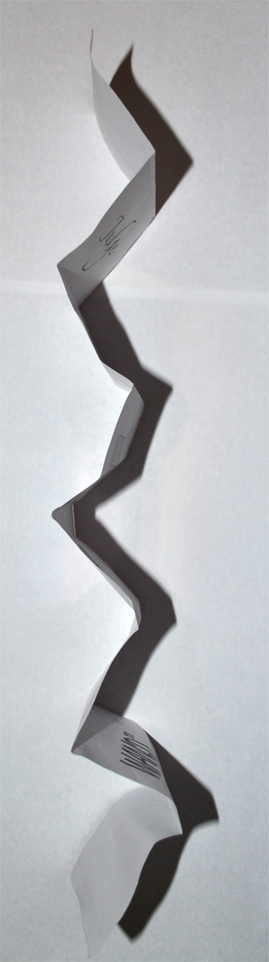
Here you can see it once it has been folded up:


I created my envelope myself. Instead of hand drawing it out with pencil which I saw a few people doing I decided to just turn the opacity down on the envelope lines. When the envelope is printed you can hardly see the lines especially as they fall on the folds.

When I printed the envelope for the first time I set the opacity to 5% which showed up on screen but when printed didn't show up. I changed the opacity to 10%

Mail shot

No comments:
Post a Comment