We started off by sorting through the different variations of violets. The task was to start sorting them into a colour wheel.
This is the whole colour wheel after we all arranged the colours. Ours went from light violet to dark violet and then to light violet pink joining the red group to the right.
We then had to then sort the 10 colours into Tints, Shades, Hues and one primary colour or the most vivid violet we could find. After we did this we had to find the PANTONE colour codes. Wikipedia - "The Pantone Colour Matching System is largely a standardized colour reproduction system. By standardizing the colors, different manufacturers in different locations can all refer to the Pantone system to make sure colours match without direct contact with one another"
This is important as you can end up spending a lot more money on printing if the prints are not the colour you thought you were printing. Accidental colour variations could effect costs also as some colours are more expensive then others, combinations of colours etc.
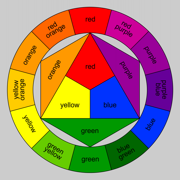
Colour wheel:

Colour wheel:

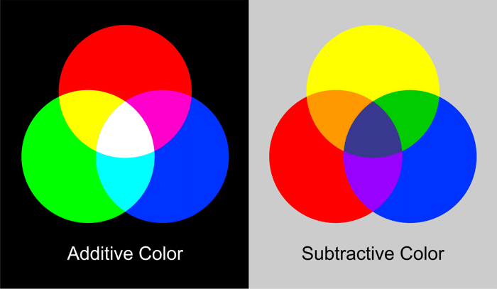
ADDITIVE and SUBTRACTIVE COLOR
There are two basic colour models: Additive colour and subtractive colour. Additive colour involves the mixing of coloured light. The colours on a television screen are a good example of this. Additive primary colours are red, green and blue.
Subtractive colour involves the mixing of coloured paints, pigments, inks and dyes. The traditional subtractive primary colours are red, yellow and blue.
I didn't take the notes in the lesson so I got the colour wheel and subtractive and additive colour theory and images from Art factory.
I didn't take the notes in the lesson so I got the colour wheel and subtractive and additive colour theory and images from Art factory.
The PANTONE colours codes for the colours we had.
PANTONE colour guide.


No comments:
Post a Comment