
This is the second time I have booked the studio to photograph these images. I explain on my last post about why the last images didn't work out. I replaced the grey background with a steel blue. The problem with the grey background was it looked like another generic white background photo shoot. The grey looked like a shadowed white.
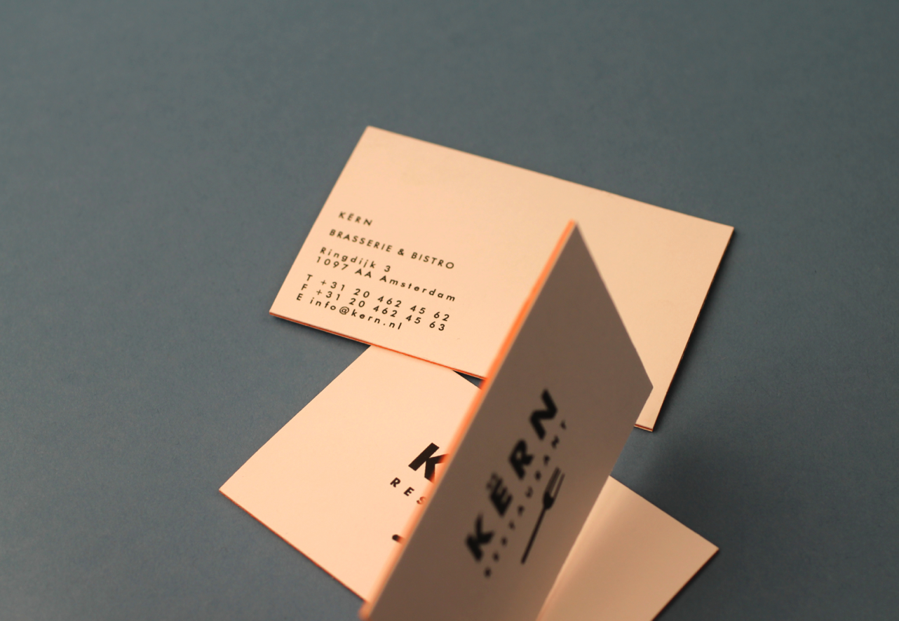
The blue makes the orange colour scheme pop off the background as well. I used to lights with umbrella defuses place left and right of the layout.
Although these are the images I am going to use for my final I still need to do some mocking up. For example I am going to put my the KERN logo on the glass water bottle.
One thing I would of changed is my hands; when I took the pictures of the business cards in my fingers, my fingers look disgusting because of the macro lens when they are as a matter of fact very well groomed.

Product mid ariel shot. I tried to mimic the style that is popular on Behance at the moment.


The water bottle was left over from the Bacardi brief (Responsive) I did not use it in the end but thought it looks great included here. It gives the restaurant branding some reference/context.


i touched the photos up and here you can the orange looks quite vibrant as before it was quite faded and soft.


The macro lens gives it a really nice effect with a depth of field. Business cards in focus and the menu out of focus.


I will mock the logo on these images.


No comments:
Post a Comment